
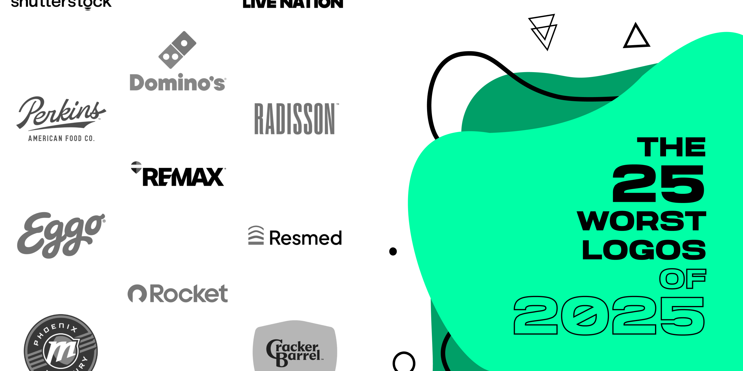
The 25 Worst Logos of 2025
A logo redesign can sharpen recognition, modernize a brand system, and improve how a company shows up across digital, print, packaging, and signage. But when a rebrand removes too much equity, leans on generic trends, or misses the brand’s tone, the result can create confusion instead of clarity.
This ranked list breaks down the worst logo redesigns of 2025, based on recurring themes in public reaction and design critique: lost distinctiveness, weaker typography, unclear symbolism, and systems that feel interchangeable. Use these examples as a practical checklist for what to avoid in a logo refresh, brand identity update, or full rebrand.
Logos and trademarks are the property of their respective owners and are shown for identification and commentary purposes only; no endorsement is implied.
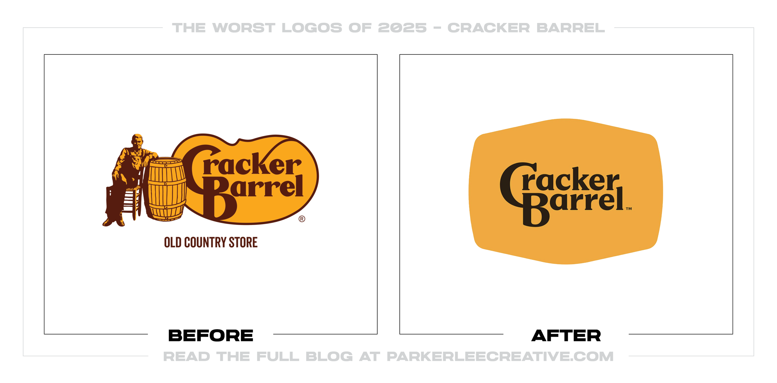
#1 - Cracker Barrel
Cracker Barrel’s refresh tries to modernize a beloved, story-rich mark, but the result reads like it sanded off the very “front-porch” warmth people associate with the brand. The move made sense as a digital-consistency play, but it was a mistake because it traded distinctive character for a safer, more generic badge that feels interchangeable in a crowded roadside-dining category.
Why It Made the List:
• The redesign removes too much narrative detail, and the brand would have been better served by simplifying the illustration while keeping a recognizable, heritage-driven signature element.
• The new system prioritizes scalability over personality, and a stronger solution would have defined a flexible set of simplified lockups that still feel unmistakably Cracker Barrel at a glance.
• The update leans “contemporary brand system” without a clear emotional payoff, and it could have worked better by explicitly preserving the brand’s craft, nostalgia, and Americana cues in the core mark.
Logos and trademarks are the property of their respective owners and are shown for identification and commentary purposes only; no endorsement is implied.
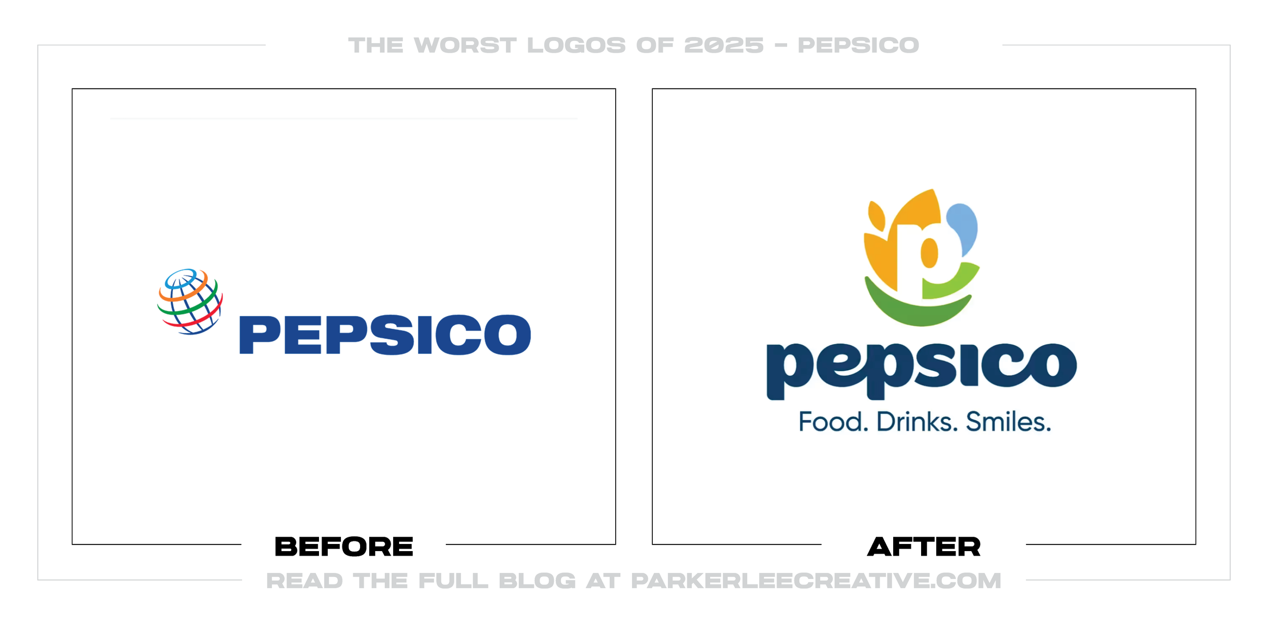
#2 - Pepsico
PepsiCo’s identity shift aims to unify an enormous portfolio under a cleaner corporate umbrella, but the execution feels overly institutional and oddly detached from the company’s cultural footprint. The timing is understandable as global brands chase consistency and efficiency, but it was a mistake because the redesign reads like compliance-first corporate polish instead of a confident parent-brand signal with real point of view.
Why It Made the List:
• The mark leans generic for a company that should look like a category leader, and it could have improved by introducing a more distinctive typography or proprietary geometry that feels owned.
• The system does not clearly connect the parent brand to its most iconic equities, and it would have benefited from a stronger visual bridge to flagship brands and recognizable heritage cues.
• The redesign looks optimized for decks and stationery rather than real-world brand moments, and it could have been stronger by proving itself across motion, retail, and sponsorship environments first.
Logos and trademarks are the property of their respective owners and are shown for identification and commentary purposes only; no endorsement is implied.
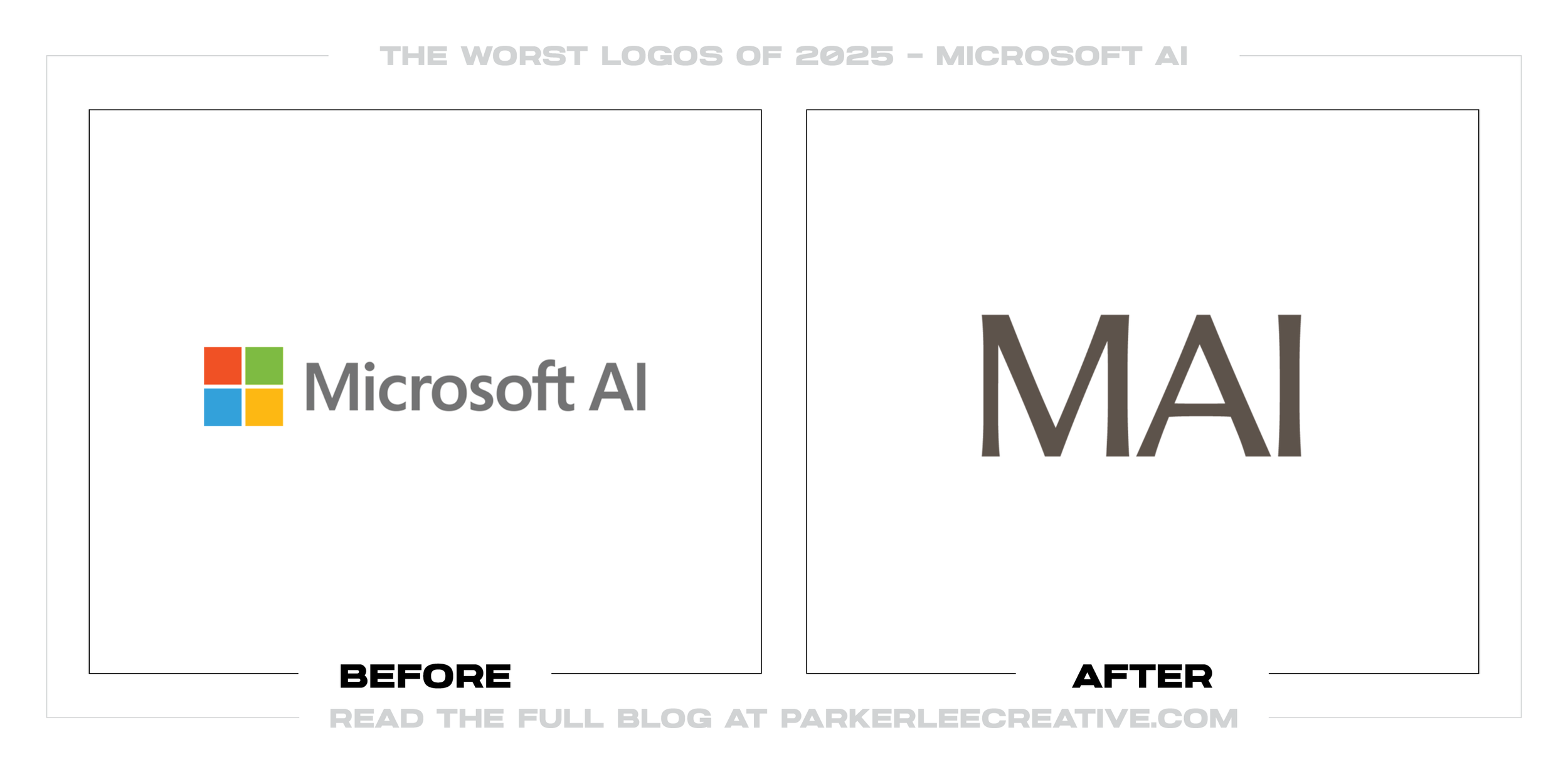
#3 - Microsoft AI
Microsoft AI’s branding pushes toward a simplified, productized AI identity, but it lands as ambiguous and hard to parse, especially for audiences already juggling Microsoft’s dense product ecosystem. The desire to clarify AI offerings is valid, but it was a mistake because the mark and naming feel like internal shorthand that makes external understanding harder, not easier.
Why It Made the List:
• The visual language feels like it belongs to a sub-brand without enough differentiation, and it would have improved with clearer hierarchy and a more explicit relationship to Microsoft’s master brand.
• The typography and shapes do not communicate a specific promise, and the system could be stronger by anchoring the design in a single, memorable metaphor tied to Microsoft’s AI positioning.
• The identity risks blending into the broader “AI sameness” trend, and it would have benefited from a proprietary motion system or distinctive color strategy that signals Microsoft immediately.
Logos and trademarks are the property of their respective owners and are shown for identification and commentary purposes only; no endorsement is implied.
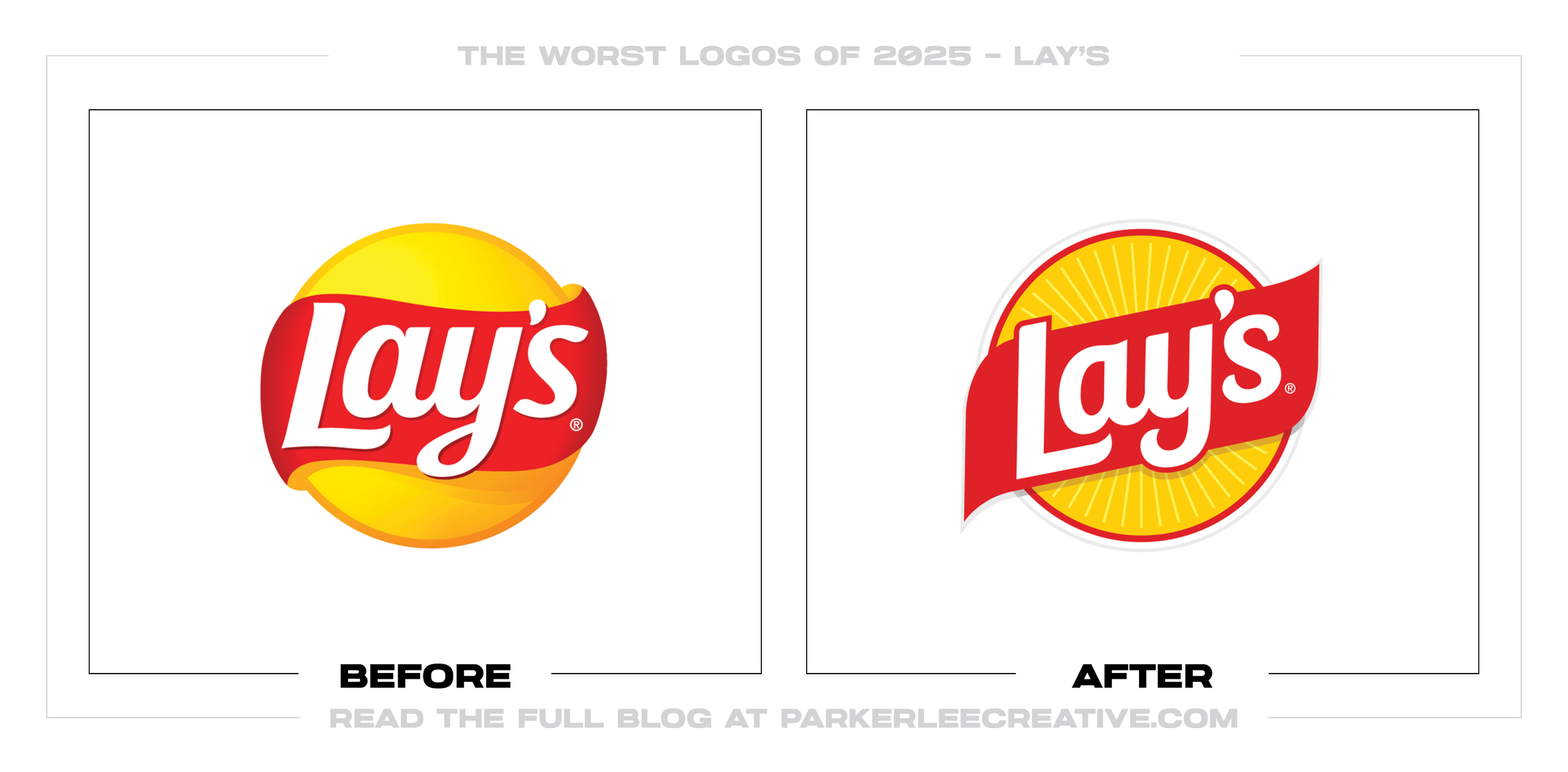
#4 - Lay’s
Lay’s brand updates are often meant to keep a familiar package looking sharp on screens and shelves, but this refresh feels like it overcorrected toward flatness and lost some of the brand’s appetite appeal. The brand likely reworked the look to improve legibility and digital performance, but it was a mistake because the new approach flattens the sensory cues that make snack branding feel craveable.
Why It Made the List:
• The design reduces depth and texture in places where flavor signaling matters most, and it could have improved by preserving bolder, more tactile product cues.
• The hierarchy appears to favor “clean” over “delicious,” and a better solution would have tested whether simplified elements still read as high-energy and indulgent at distance.
• The update feels trend-following rather than brand-leading, and it would have been stronger by retaining one unmistakable, iconic detail that competitors cannot mimic.
Logos and trademarks are the property of their respective owners and are shown for identification and commentary purposes only; no endorsement is implied.
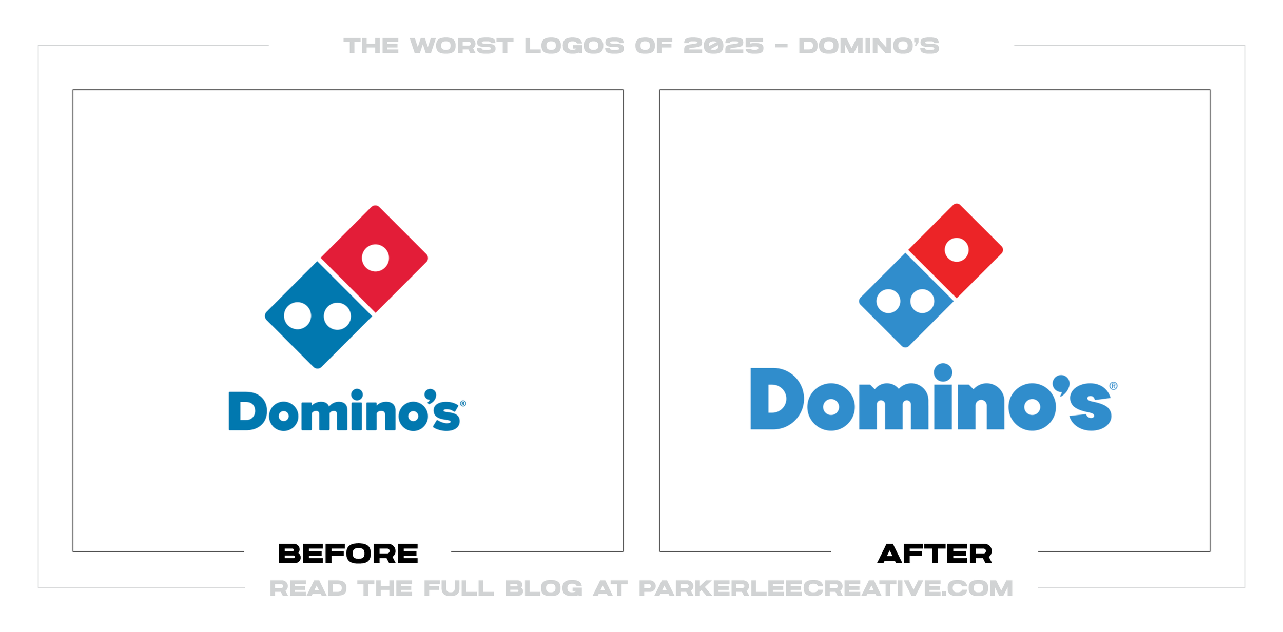
#5 - Domino’s
Domino’s is already a rare brand with a truly iconic symbol, but this refresh concept underplays that equity and leans too hard into a generic wordmark-first look. The push to streamline is understandable in a mobile-first world, but it was a mistake because Domino’s strength is instant recognition, and anything that dampens that recognition costs more than it saves.
Why It Made the List:
• The approach de-emphasizes the domino tile, and the brand would be better served by keeping the icon dominant while simplifying supporting typography around it.
• The new balance feels less ownable in a fast-food landscape full of bold sans wordmarks, and it could be improved by making the icon carry more of the identity load.
• The system looks optimized for minimalism rather than memorability, and it would be stronger if it proved superior recognition at small sizes versus the existing, widely recognized mark.
Logos and trademarks are the property of their respective owners and are shown for identification and commentary purposes only; no endorsement is implied.
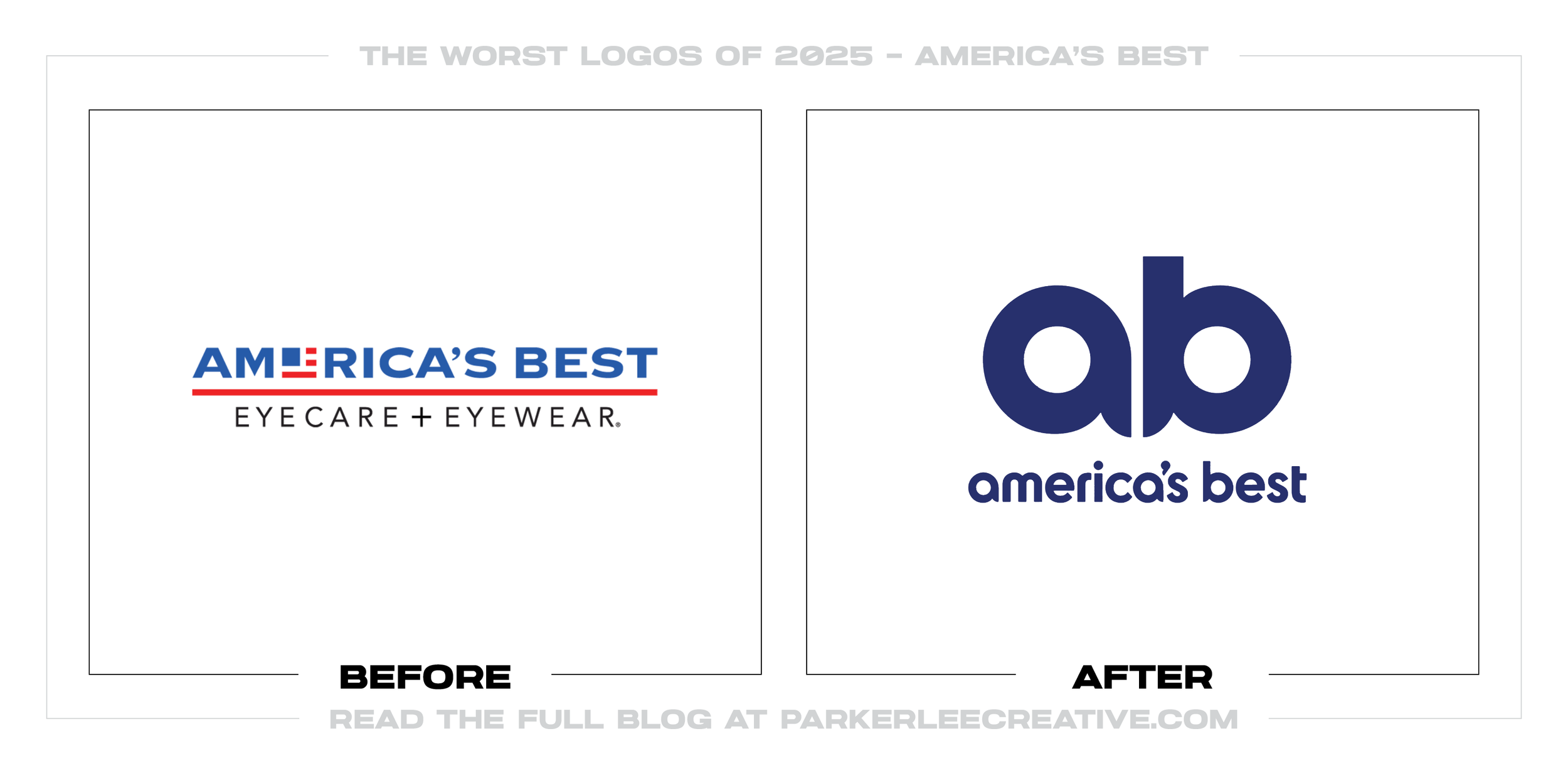
#6 - America’s Best
America’s Best looks like it tried to “clean up” and modernize, but the result feels like it stripped away clarity and replaced it with a mark that is less legible and less category-specific. The rebrand timing makes sense as value retailers compete on digital experience, but it was a mistake because the identity no longer communicates “optical” as quickly or confidently as it should.
Why It Made the List:
• The typography and symbol do not immediately signal vision care, and the redesign could have improved by integrating a more explicit optical cue without becoming cliché.
• The mark feels generic for a national chain, and it would be stronger with a more ownable shape system that can extend across signage, frames, and retail environments.
• The new look does not clearly elevate perceived trust, and it could have been improved by prioritizing professionalism and readability over novelty.
Logos and trademarks are the property of their respective owners and are shown for identification and commentary purposes only; no endorsement is implied.
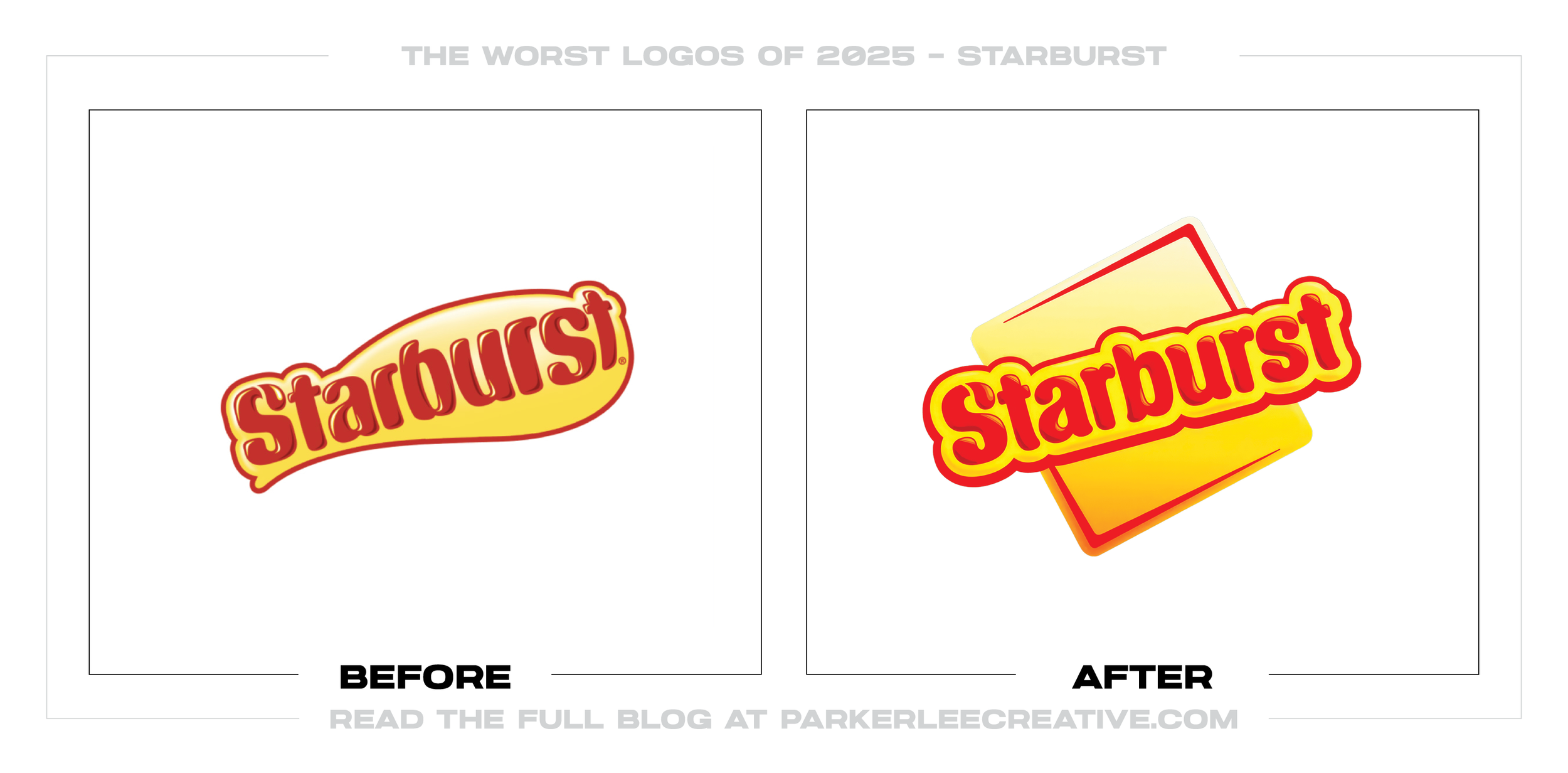
#7 - Starburst
Starburst’s refresh tries to look modern and energetic, but the outcome feels like it swapped recognizable personality for a more anonymous, trend-aligned aesthetic. The brand likely wanted a cleaner system for digital and global packaging, but it was a mistake because the update softens the playful punch that made Starburst instantly identifiable.
Why It Made the List:
• The redesign under-delivers on “burst” energy, and it could have improved by building stronger motion cues, sharper geometry, or more dynamic typography.
• The new look does not clearly separate Starburst from other candy brands chasing minimalism, and it would be stronger with a more proprietary visual gimmick that only Starburst could own.
• The system feels more polished than fun, and it could have been improved by protecting the brand’s maximal, colorful personality as a non-negotiable design constraint.
Logos and trademarks are the property of their respective owners and are shown for identification and commentary purposes only; no endorsement is implied.
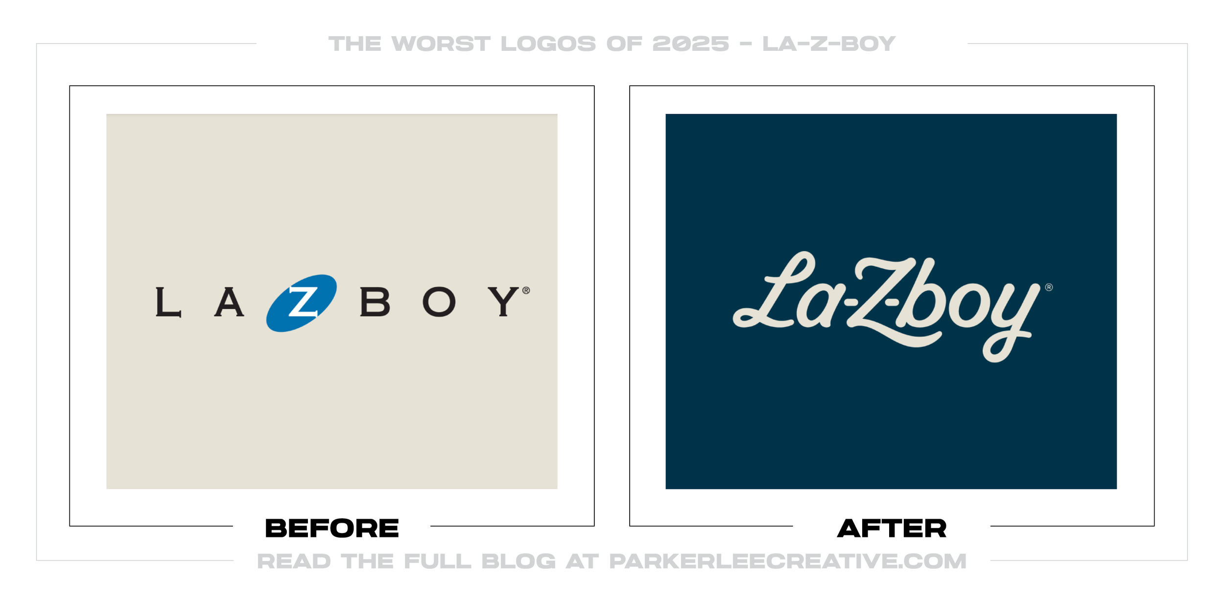
#8 - La-Z-boy
La-Z-Boy’s update aims to reposition the brand with a cleaner, more contemporary feel, but the execution reads like it diluted the unique name and heritage into something safer and less memorable. The company likely felt pressure to look more design-forward, but it was a mistake because the redesign sacrifices distinctiveness and readability in exchange for a look that could belong to many furniture brands.
Why It Made the List:
• The typography reduces the brand’s character, and it could have improved by retaining a more recognizable letterform structure while still refining the mark.
• The new system does not clearly communicate comfort and longevity, and it would be stronger if it paired modern styling with warmer, more human cues.
• The redesign looks like a trend response rather than a brand truth, and it could have been improved by building from La-Z-Boy’s unique equity instead of stepping away from it.
Logos and trademarks are the property of their respective owners and are shown for identification and commentary purposes only; no endorsement is implied.
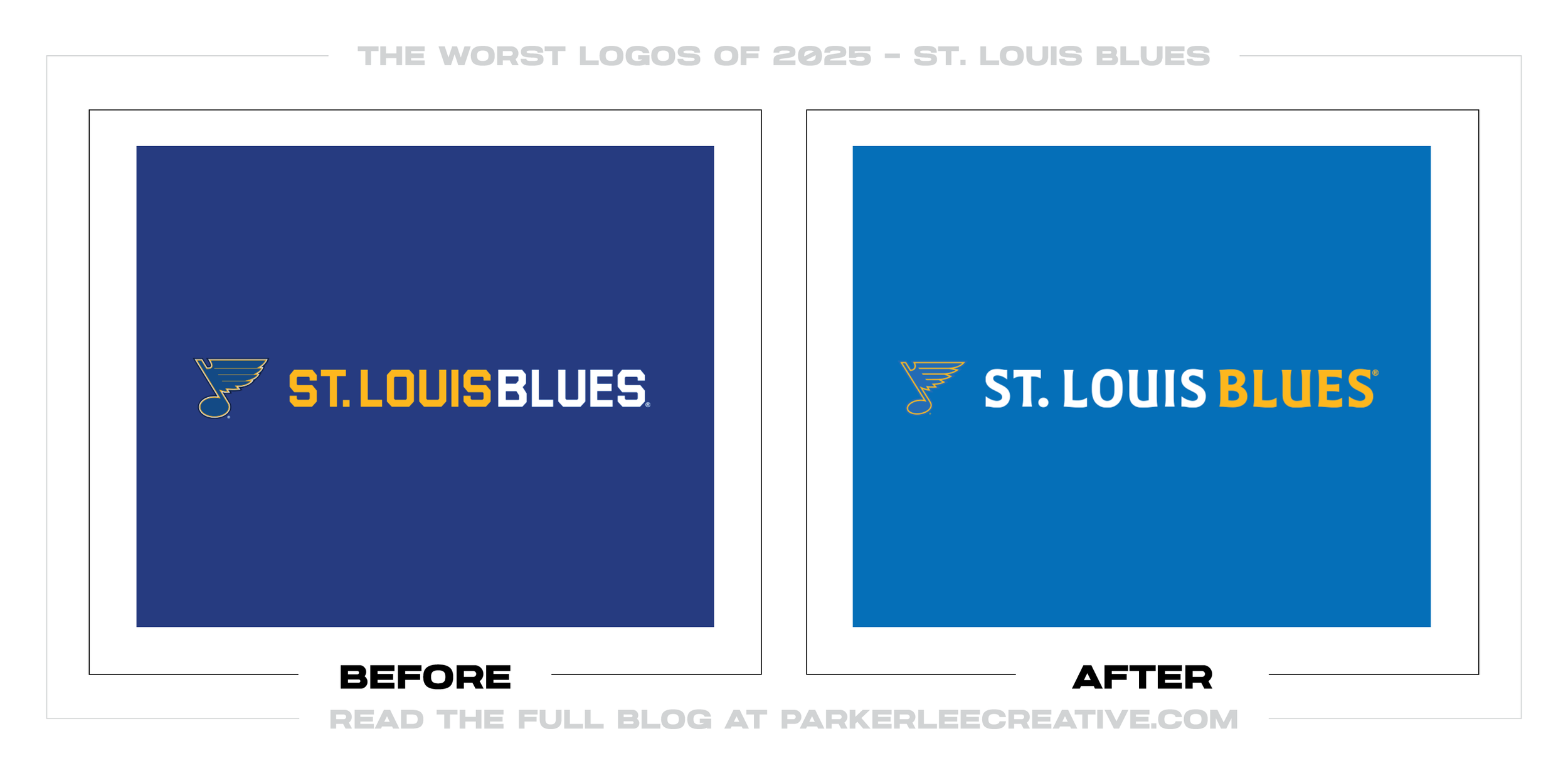
#9 - St. Louis Blues
The Blues’ refresh pushes toward a cleaner, more modern sports identity, but the changes read as incremental in the wrong places and disruptive in the right ones. The intent to tighten consistency across digital and merchandise is valid, but it was a mistake because sports marks live on instant recognition, and small proportion shifts can make a logo feel “off” to fans.
Why It Made the List:
• The revised proportions and detailing risk weakening helmet-and-hat recognition, and the update could have improved by preserving the most iconic silhouette elements more aggressively.
• The system prioritizes uniformity over attitude, and it would be stronger if it amplified the team’s distinct edge instead of smoothing it out.
• The redesign does not clearly justify itself with a better on-ice or merch application, and it could have improved by proving clear functional wins before changing the core mark.
Logos and trademarks are the property of their respective owners and are shown for identification and commentary purposes only; no endorsement is implied.
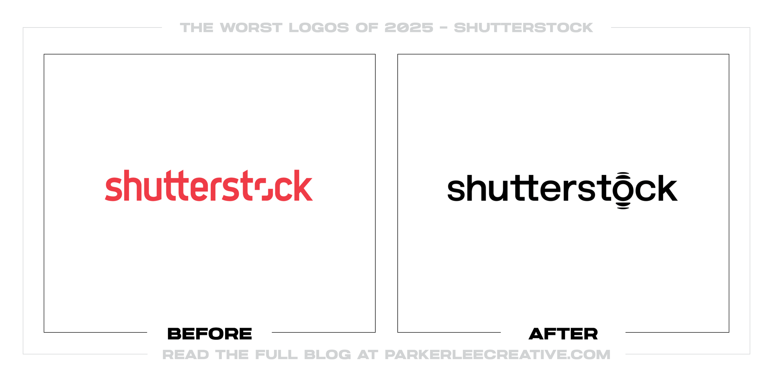
#10 - Shutterstock
Shutterstock’s rebrand tries to look more premium and “platform-like,” but the new direction reads as generic tech minimalism and loses the distinct visual cue people remembered. The company likely wanted to signal evolution beyond stock imagery, but it was a mistake because the redesign removes differentiation in a market where brand recall is the competitive advantage.
Why It Made the List:
• The new mark leans into a common sans-serif tech look, and it would have improved by keeping a more ownable symbol or typographic quirk.
• The identity does not clearly communicate what changed about the product, and it could have been stronger by pairing the redesign with a clearer, more specific brand promise.
• The system feels interchangeable with other creative platforms, and it would be better if it reclaimed a distinct visual concept tied to creativity, motion, or curation.
Logos and trademarks are the property of their respective owners and are shown for identification and commentary purposes only; no endorsement is implied.
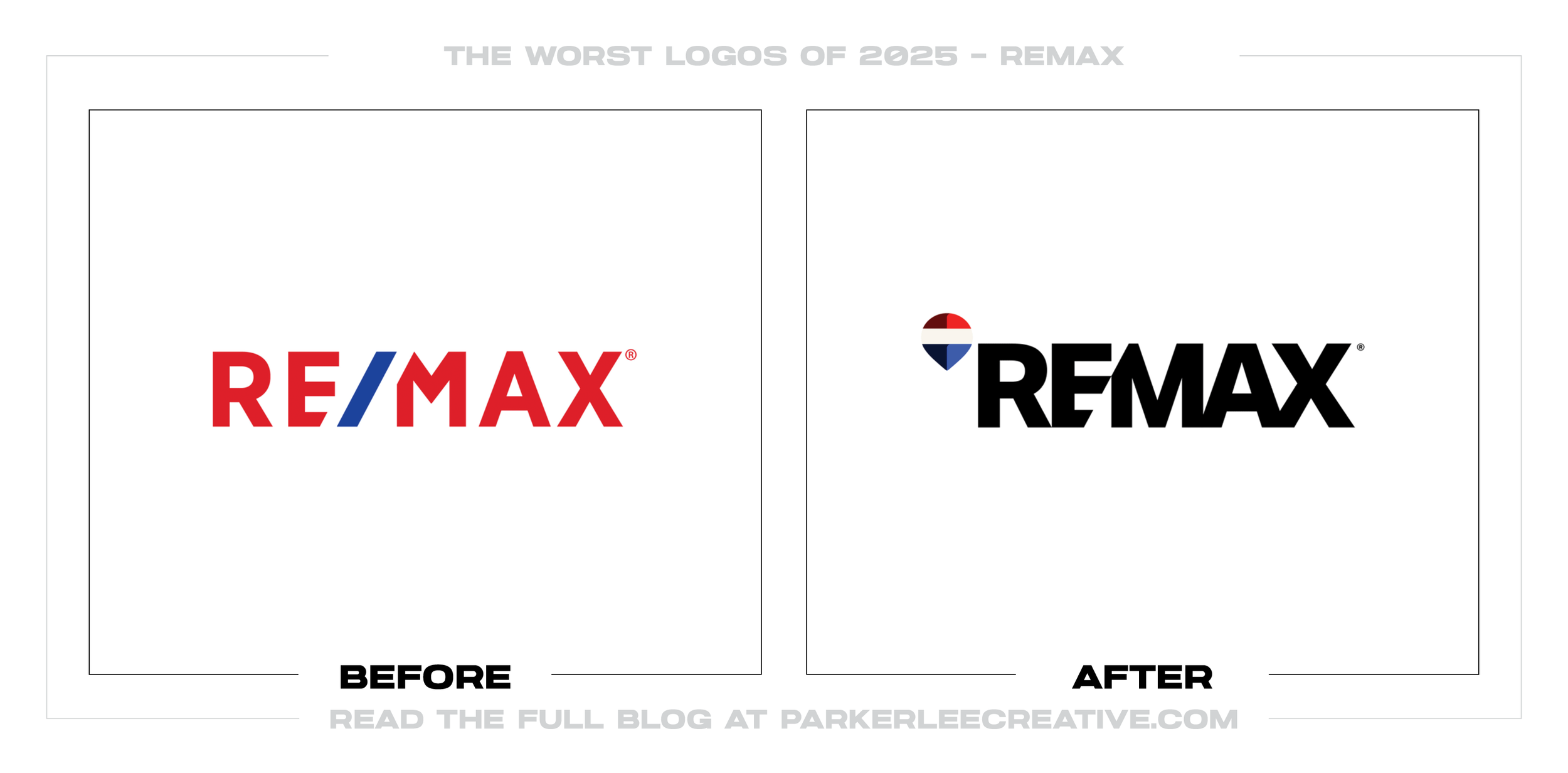
#11 - REMAX
RE/MAX’s update looks like it aimed to modernize a classic real-estate wordmark, but it introduced awkward geometry that makes the type feel less stable and less premium. The desire to refresh is understandable as real estate competes in a digital-first environment, but it was a mistake because the redesign complicates what was already a strong, instantly readable brand asset.
Why It Made the List:
• The letterform cuts create visual noise, and the mark could have improved by modernizing spacing and weights without breaking the typography’s integrity.
• The updated structure feels less trustworthy, and it would be stronger if it emphasized solidity and clarity, which are essential cues in real estate branding.
• The redesign looks like change for change’s sake, and it could have been improved by focusing on a system update (digital, templates, signage) while keeping the core wordmark intact.
Logos and trademarks are the property of their respective owners and are shown for identification and commentary purposes only; no endorsement is implied.
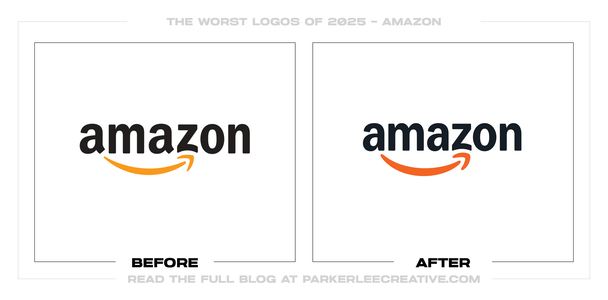
#12 - Amazon
Amazon’s 2025 global identity overhaul was built to unify the parent brand and 50+ sub-brands across 15 markets, but the core refresh feels more like governance than brand-building.
Why It Made the List:
• The “warmer smile” and modernized wordmark read cleaner, but also more generic, dialing down the charm.
• The unified system creates consistency at scale, but it also smooths away contrast; sub-brands start to feel templated instead of meaningfully distinct.
• The refinement prioritizes neutrality, which can cost instant recognition and personality in small-size, fast-scroll, or icon-first contexts.
Logos and trademarks are the property of their respective owners and are shown for identification and commentary purposes only; no endorsement is implied.
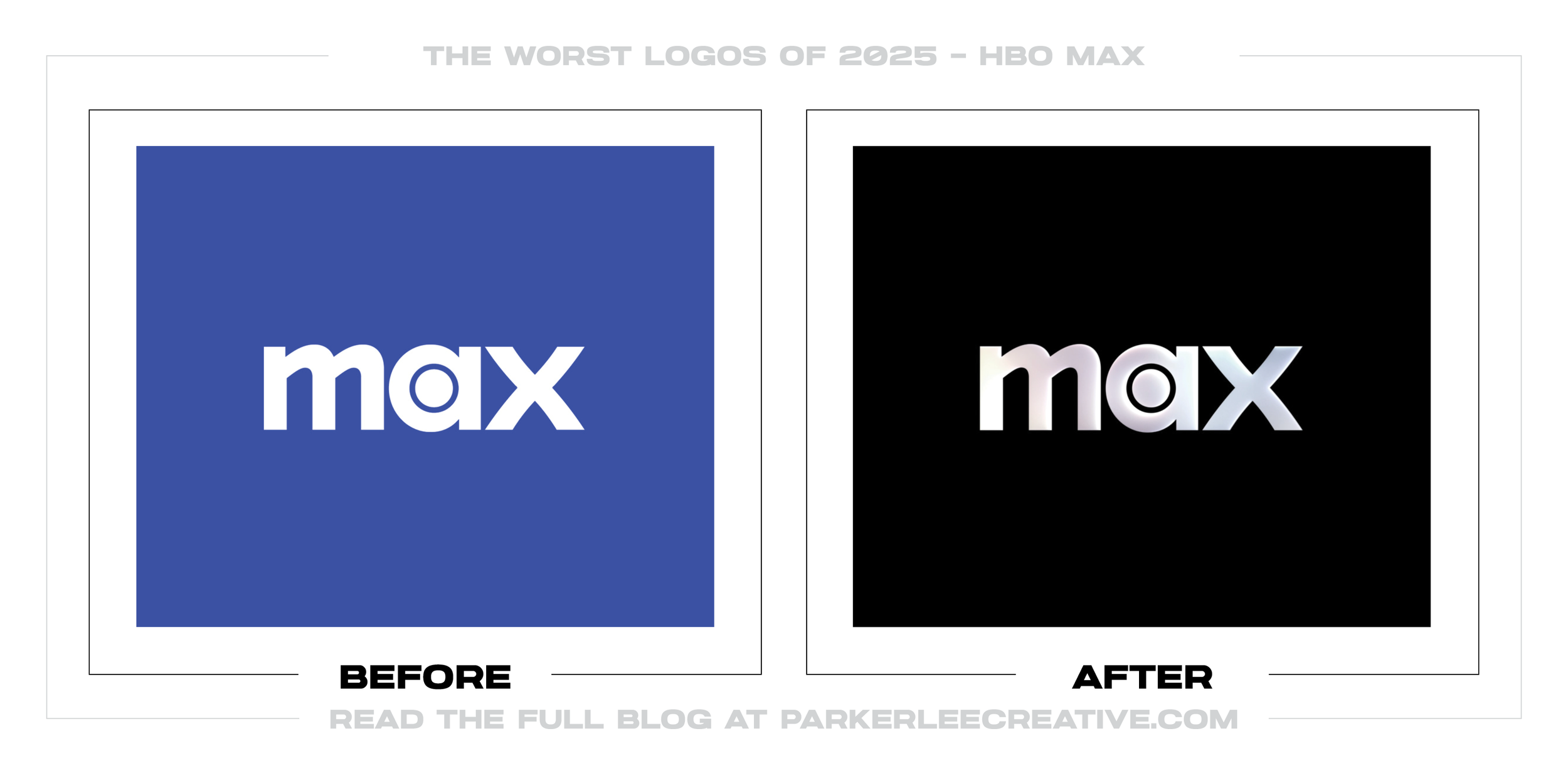
#13 - MAX
The Max-era logo shift aims for a more flexible, modern entertainment brand, but the styling choices feel like they chase novelty while losing the confident simplicity premium streaming needs. The company clearly rebranded to broaden appeal beyond “HBO,” but it was a mistake because the identity blurs the prestige association that made HBO a differentiator in the first place.
Why It Made the List:
• The visual system dilutes the HBO equity, and it could have improved by maintaining a stronger, clearer link to HBO’s premium legacy while still expanding the umbrella.
• The new aesthetic risks feeling trend-based, and it would be stronger with a more timeless typographic foundation and less gimmicky styling.
• The mark does not always signal “premium,” and it could have improved by testing whether the new logo reads as high-end across content genres and UI contexts.
Logos and trademarks are the property of their respective owners and are shown for identification and commentary purposes only; no endorsement is implied.
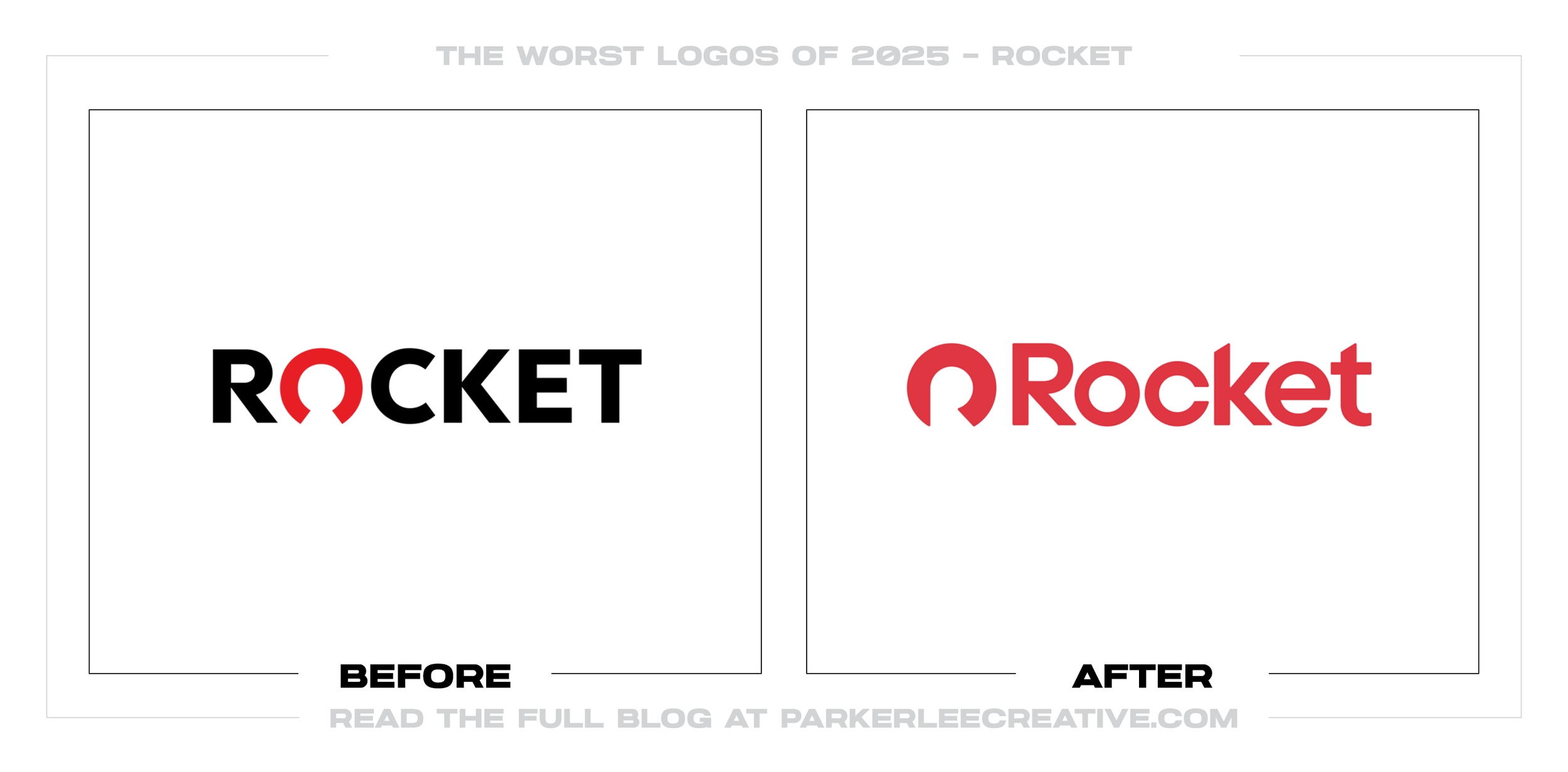
#14 - Rocket
Rocket’s brand move toward a simplified “Rocket” identity is meant to unify offerings and sharpen recall, but the new mark feels less trustworthy and more startup-generic than a major financial brand should. The intent to streamline naming is understandable, but it was a mistake because the redesign reduces perceived stability, which is the exact cue financial services must protect.
Why It Made the List:
• The symbol feels more decorative than meaningful, and it would be stronger if the icon communicated progress and trust with clearer, more legible geometry.
• The typography reads less established than the category demands, and it could have improved by choosing a type system that signals credibility first and trendiness second.
• The redesign does not clearly outperform the previous equity, and it would be better if it proved improved recognition and confidence in real consumer testing.
Logos and trademarks are the property of their respective owners and are shown for identification and commentary purposes only; no endorsement is implied.
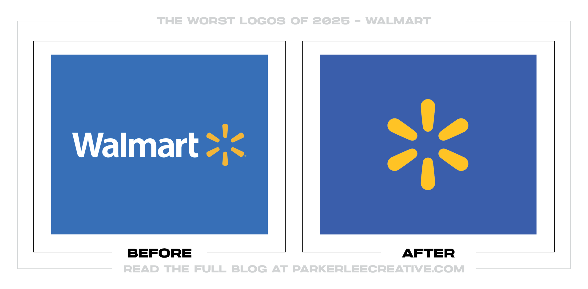
#15 - Walmart
Walmart’s identity shift pushes toward a more icon-led presence, but the result overemphasizes the “spark” at the expense of the wordmark clarity people still rely on. The brand likely wanted a more flexible system for digital and private label, but it was a mistake because the redesign invites confusion when the icon is used alone without enough context.
Why It Made the List:
• The icon-only move assumes universal recognition, and it could have improved by defining stricter rules for when the wordmark must appear.
• The new balance reduces immediate readability, and it would be stronger if it preserved the wordmark as the primary anchor while using the spark as a secondary enhancer.
• The system risks looking like a generic app badge, and it could have improved by developing more proprietary brand behaviors beyond a single symbol.

Logos and trademarks are the property of their respective owners and are shown for identification and commentary purposes only; no endorsement is implied.
#16 - Evernote
Evernote’s rebrand tries to signal a modern productivity platform, but the changes land as a flattening of personality and a loss of the distinctive “elephant” charm users remembered. The company had good reasons to refresh after years of product and ownership shifts, but it was a mistake because the redesign feels more like a generic SaaS identity than a beloved tool with a unique visual voice.
Why It Made the List:
• The icon simplification reduces character, and it would be stronger if it retained a more recognizable, ownable elephant silhouette.
• The typography leans into category sameness, and it could have improved by introducing more distinctive letterforms or a proprietary typographic detail.
• The new system does not clearly add functional benefits, and it would be better if the redesign were tied to clearer UX, hierarchy, and brand consistency that users can feel.
Logos and trademarks are the property of their respective owners and are shown for identification and commentary purposes only; no endorsement is implied.
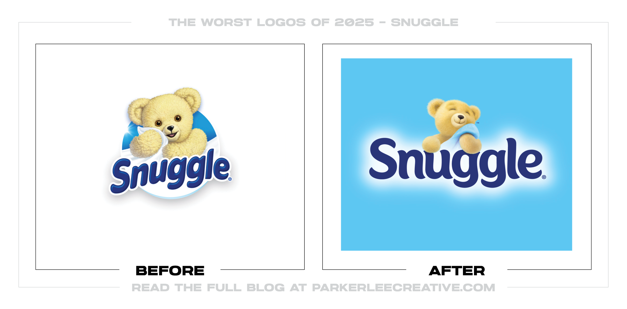
#17 - Snuggle
Snuggle’s refresh aims to feel cleaner and more contemporary, but the update risks losing the cozy, nostalgic warmth that made the brand instantly approachable. The desire to modernize is understandable as packaging fights for attention in digital thumbnails and on shelf, but it was a mistake because the redesign leans too far into “polished” and not enough into “soft.”
Why It Made the List:
• The typography and layout feel less cuddly than the category expects, and it could have improved by keeping softer curves and a more comforting hierarchy.
• The bear equity is not leveraged as powerfully as it could be, and the system would be stronger if the mascot remained a primary recognition driver.
• The redesign looks trend-following, and it could have improved by protecting a stronger nostalgia cue that competitors cannot replicate.
Logos and trademarks are the property of their respective owners and are shown for identification and commentary purposes only; no endorsement is implied.
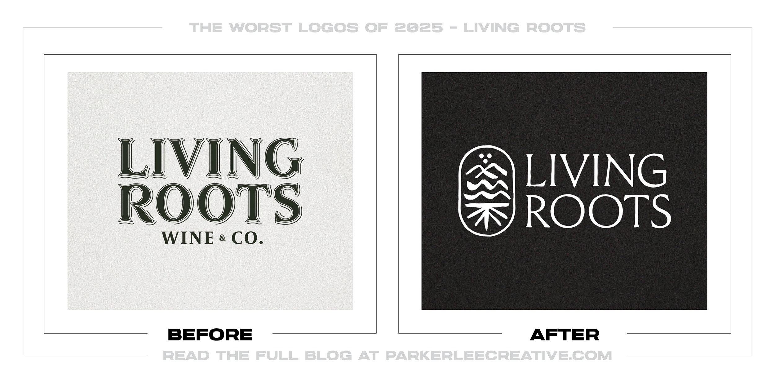
#18 - Living Roots
Living Roots’ rebrand pushes toward a more premium, minimalist look, but it reads as overly serious and less inviting than a wine brand that should feel warm and discoverable. The shift likely aimed to elevate shelf presence and modernize the brand story, but it was a mistake because the new identity feels less differentiated and less emotionally accessible.
Why It Made the List:
• The typography feels formal without being distinctive, and it could have improved by using more ownable letterforms or a unique typographic detail.
• The symbol lacks immediate storytelling, and it would be stronger if it more clearly communicated “roots,” place, or craft in a way people can recall quickly.
• The redesign prioritizes “premium minimal” over brand personality, and it could have been improved by keeping one expressive element that signals warmth and approachability.
Logos and trademarks are the property of their respective owners and are shown for identification and commentary purposes only; no endorsement is implied.
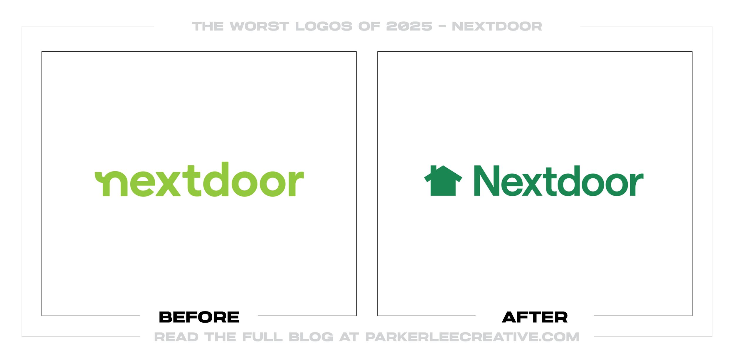
#19 - Nextdoor
Nextdoor’s update tries to look more mature and trustworthy, but the new house icon and wordmark combo feels generic and less neighborly than the brand promise requires. The company clearly wanted to reset perception and reduce clutter, but it was a mistake because the redesign strips away the friendly charm and replaces it with an identity that could belong to any local services app.
Why It Made the List:
• The icon is too literal and too common, and it would have improved by creating a more unique neighborhood metaphor that is unmistakably Nextdoor.
• The wordmark feels corporate rather than community-first, and it could be stronger with warmer typography and more human spacing choices.
• The system under-delivers on “neighborly,” and it would be better if the redesign built in visual cues of connection, conversation, and local belonging.
Logos and trademarks are the property of their respective owners and are shown for identification and commentary purposes only; no endorsement is implied.
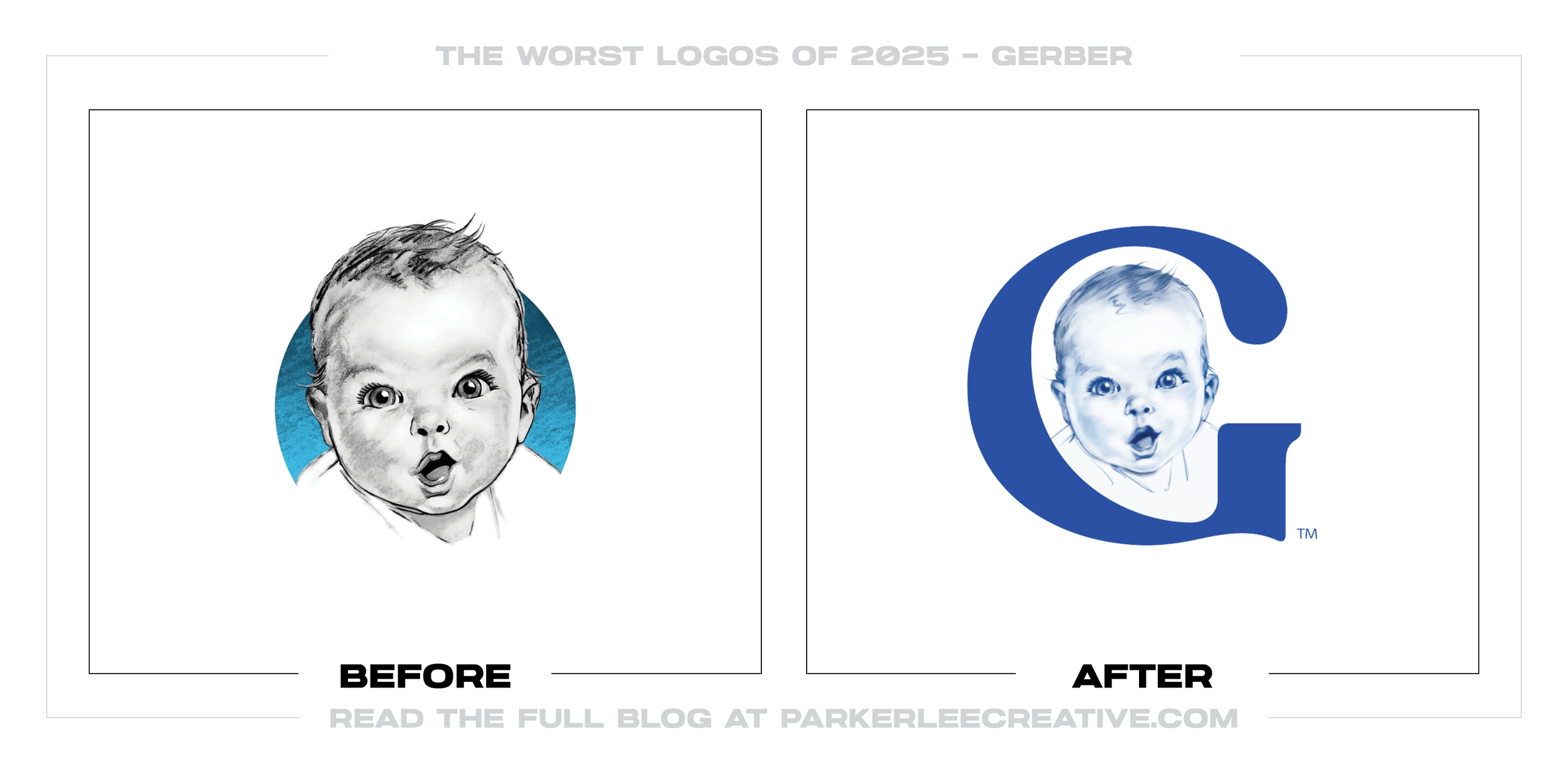
#20 - Gerber
Gerber’s logo shift tries to modernize an iconic baby face by reframing it into a letterform-driven mark, but the result feels like it forced a clever idea at the expense of emotional clarity. The brand likely wanted a bolder, simpler asset for packaging and digital, but it was a mistake because the redesign turns an instantly human symbol into a more abstract concept that reads colder.
Why It Made the List:
• The “G” concept competes with the baby rather than supporting it, and it could have improved by keeping the baby as the primary mark and simplifying around it.
• The new lockup would be stronger if the redesign protected the heritage illustration as a recognizable anchor.
• The update prioritizes cleverness over comfort, and it could have improved by testing whether parents interpret the new mark as warmer, safer, and more trustworthy.
Logos and trademarks are the property of their respective owners and are shown for identification and commentary purposes only; no endorsement is implied.
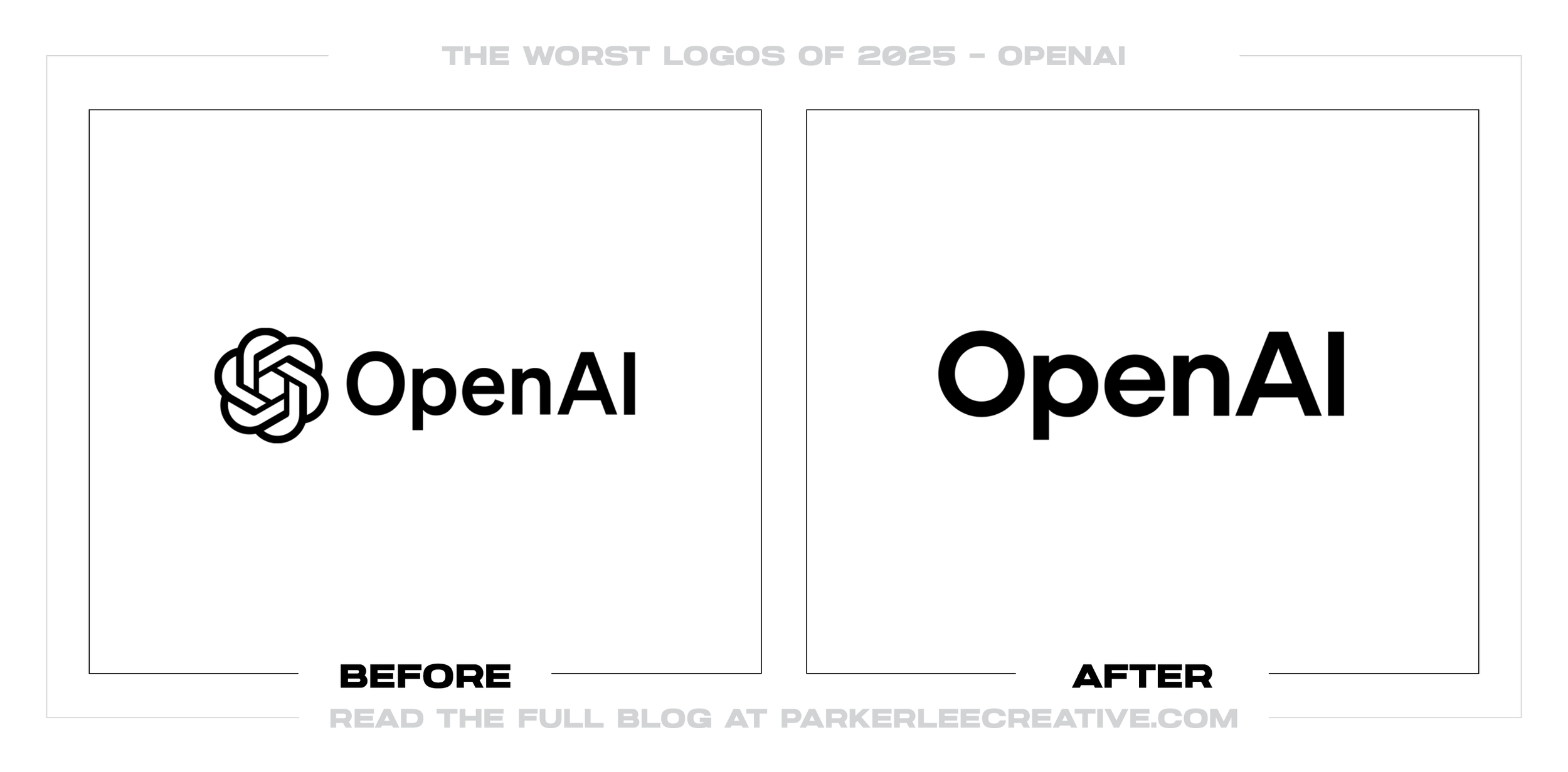
#21 - OpenAI
OpenAI’s visual shift aims to look more refined and product-ready, but the new wordmark direction feels like it traded distinctive symbolism for a safer corporate typography move. The push makes sense as the organization expands consumer products and partnerships, but it was a mistake because the redesign reduces the unique visual signature that helped the brand stand apart in a crowded AI landscape.
Why It Made the List:
• The updated typography looks closer to generic tech branding, and it could have improved by preserving more ownable forms or a distinctive typographic gesture.
• The change deemphasizes the recognizable symbol equity, and it would be stronger if the symbol remained central as the primary recognition asset.
• The system feels more “company” than “mission,” and it could have improved by aligning the identity more clearly with OpenAI’s public-facing purpose and values.
Logos and trademarks are the property of their respective owners and are shown for identification and commentary purposes only; no endorsement is implied.
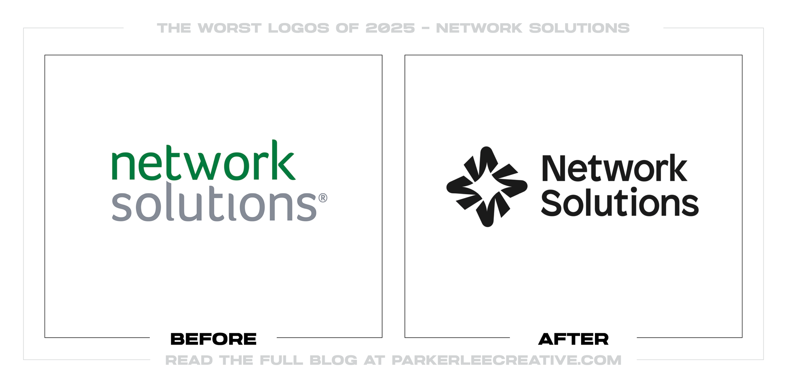
#22 - Network Solutions
Network Solutions’ refresh appears to aim for a cleaner, more modern presence, but the new icon feels abstract in a way that does not help a legacy domain and hosting brand communicate clarity or trust. The impulse to rebrand is understandable as the category modernizes, but it was a mistake because the redesign does not immediately say what the company does, and it does not look more credible than before.
Why It Made the List:
• The symbol reads as generic “tech shape,” and it would be stronger if it referenced domains, connections, or infrastructure more explicitly.
• The typography and icon combination lacks hierarchy, and it could have improved by tightening spacing, improving legibility, and clarifying which element leads.
• The system feels like a cosmetic update, and it would be better if the brand refreshed the full experience, product naming, UI, and messaging; so the logo actually represents a real change.
Logos and trademarks are the property of their respective owners and are shown for identification and commentary purposes only; no endorsement is implied.
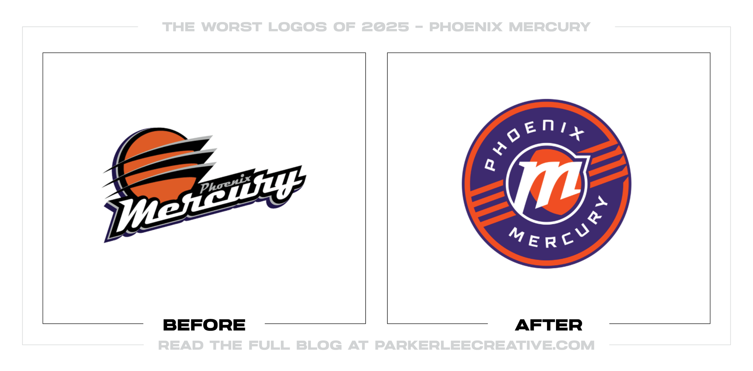
#23 - Phoenix Mercury
Phoenix Mercury’s rebrand pushes toward a bold, badge-style identity, but the result feels busy and less iconic than a modern sports mark needs to be across social, merch, and broadcast. The desire to modernize is understandable as teams chase stronger merchandise systems, but it was a mistake because the new badge sacrifices instant readability and relies on complexity that breaks down at small sizes.
Why It Made the List:
• The badge contains too many competing elements, and it could have improved by reducing the concept to one dominant symbol with fewer supporting details.
• The typography and ring layout reduce quick recognition, and it would be stronger if the mark were designed to read clearly in a one-second glance.
• The redesign feels more like a patch than a logo, and it could have improved by building a flexible system that includes a simple primary mark and a separate secondary badge for special applications.
Logos and trademarks are the property of their respective owners and are shown for identification and commentary purposes only; no endorsement is implied.
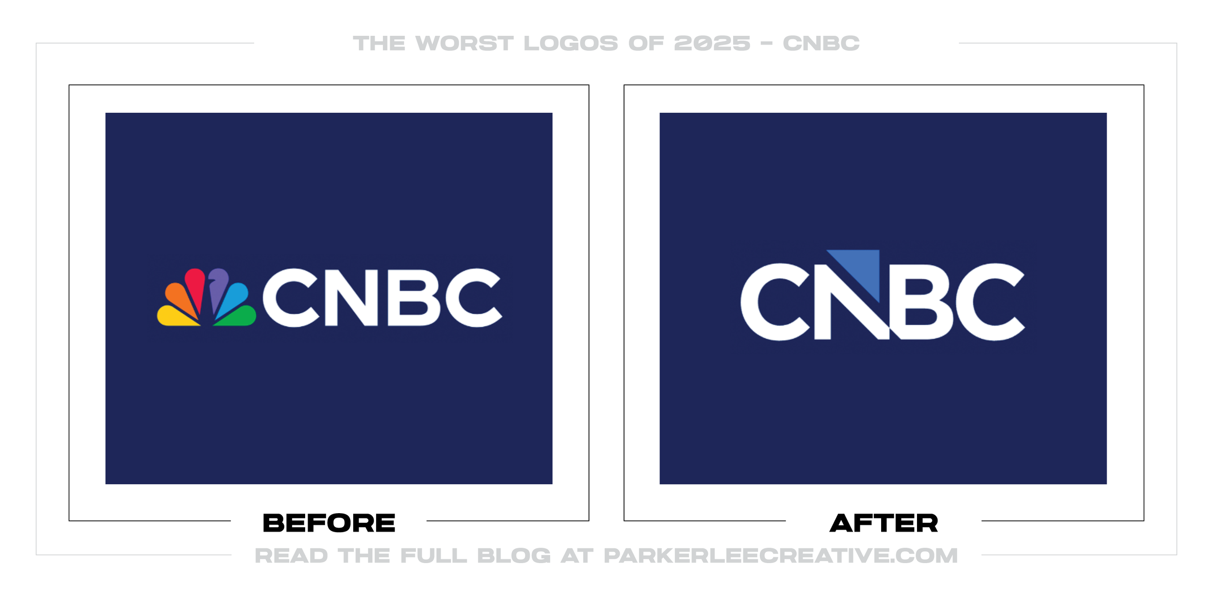
#24 - CNBC
CNBC’s shift toward a simplified mark aims to modernize the network’s presence, but the result feels like it removed a signature recognition asset and replaced it with a colder, less distinctive monogram. The timing makes sense as networks reposition and refresh for streaming-era branding, but it was a mistake because the redesign leans into abstraction and loses the instant personality that helped CNBC stand out.
Why It Made the List:
• The new mark reduces distinctive equity, and it could have improved by retaining a recognizable brand cue while still refining the typography.
• The identity reads more like a generic corporate acronym, and it would be stronger with a more ownable typographic construction or a proprietary symbol system.
• The redesign prioritizes minimalism over memorability, and it could have improved by proving stronger recognition and clearer brand signaling in motion, not just as a static logo.
Logos and trademarks are the property of their respective owners and are shown for identification and commentary purposes only; no endorsement is implied.
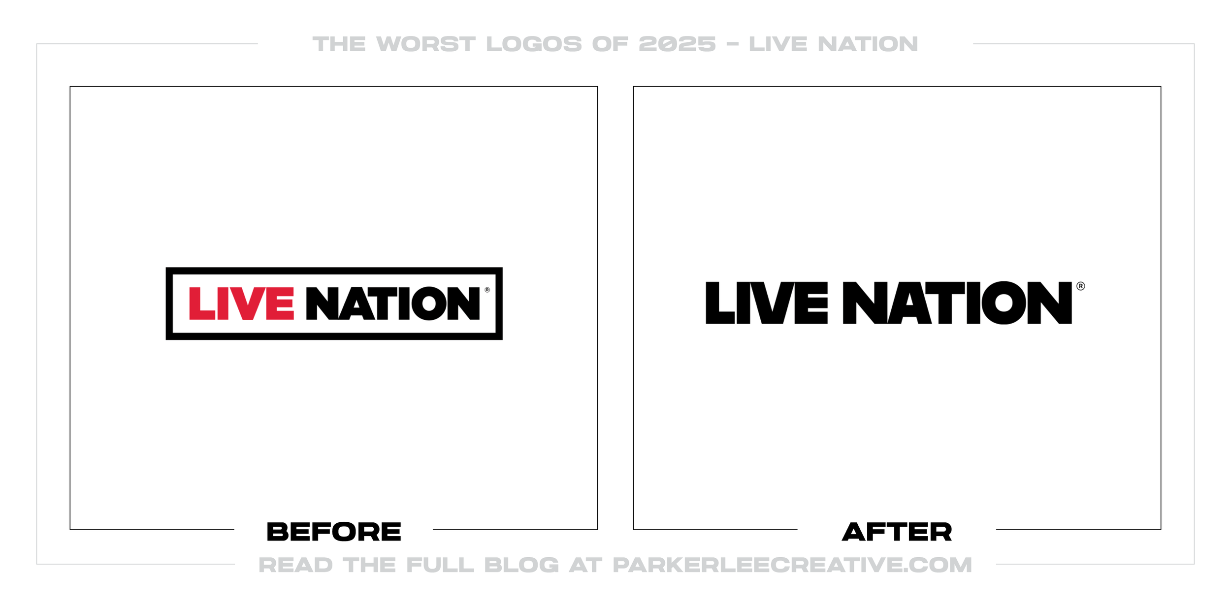
#25 - Live Nation
Live Nation’s refreshed identity pushes for a cleaner, more “modern” look, but it trades away the grit and electricity that should feel native to live entertainment. The system reads more like a corporate parent brand than a brand that sells moments.
Why It Made the List:
• The mark feels generic and platform-safe, with limited ownability in a category packed with bold, high-energy identities.
• The redesign flattens the brand’s personality; it doesn’t visually communicate sound, movement, crowd, or performance in a memorable way.
• The hierarchy between icon, wordmark, and sub-brands feels overly standardized, making everything look templated instead of distinct.
A logo redesign can be a smart move, but only when it’s guided by strategy, not trends. In 2025, plenty of rebrands looked clean on paper, yet struggled in real-world use where clarity, recognition, and consistency matter most. That’s the risk with logo decisions made without a clear process: even small changes can quietly dilute trust, reduce memorability, and create confusion across marketing, digital, and print.
Working with a professional keeps the focus on what matters: protecting existing brand recognition, improving how the mark performs everywhere it appears, and building a visual foundation that supports long-term growth.
If you’re considering a rebrand, now is the right time to reach out! Your brand’s identity is your greatest asset! You build trust sooner, show up consistently everywhere, and create meaningful connections with your customers. Use the form below to contact below and together, we’ll define your brand, tell your story, and help your business grow!
Legal Disclaimer: This content is provided for educational and informational purposes and is intended as commentary and criticism; all product names, logos, and trademarks are the property of their respective owners, and any copyrighted materials shown are used under the principles of fair use solely to identify the subjects discussed and to support analysis, with only the limited portions reasonably necessary displayed; no sponsorship, endorsement, affiliation, or partnership is implied, and nothing on this page constitutes legal, financial, or other professional advice.