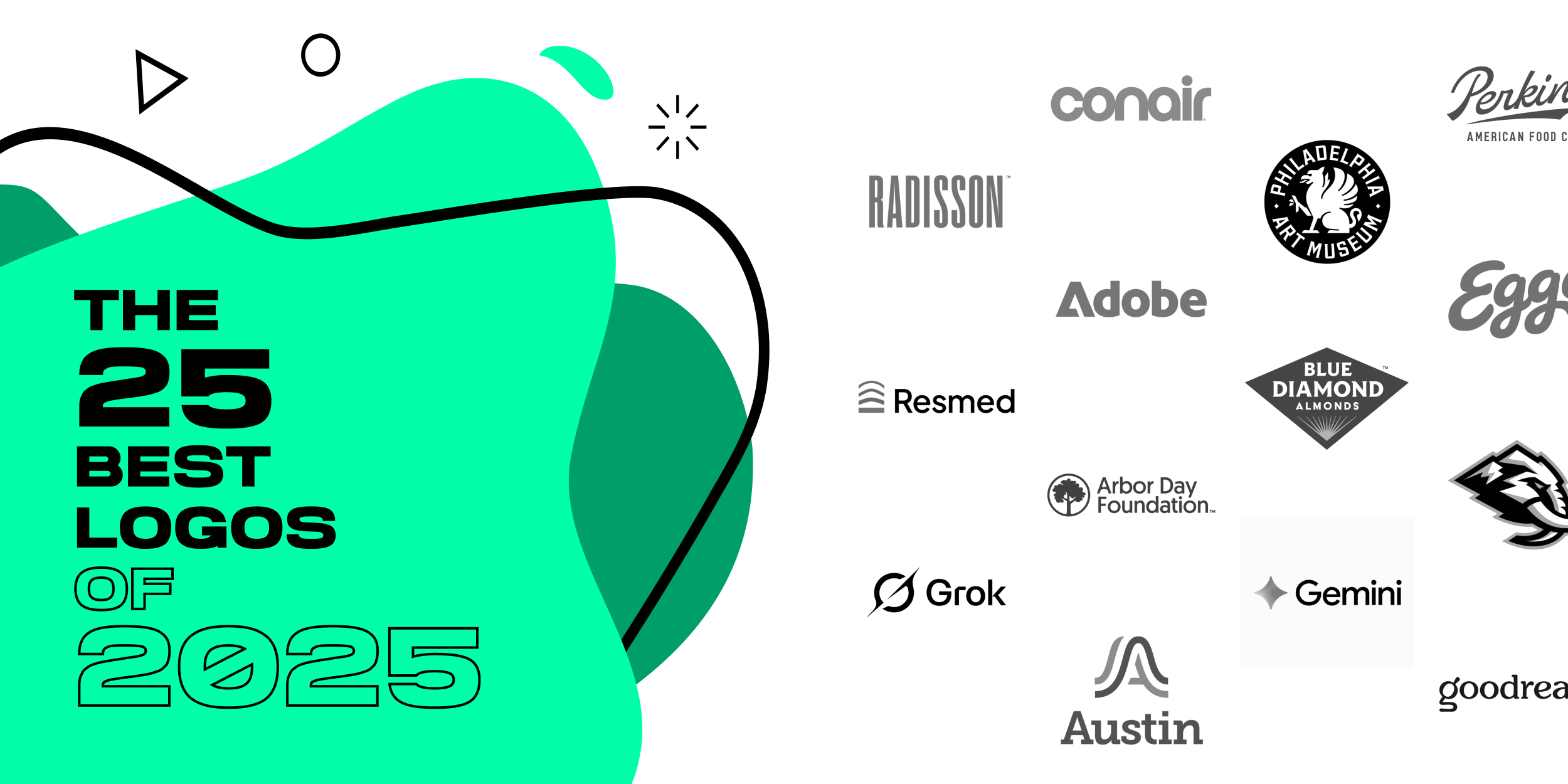
The 25 Best Logos of 2025
A logo redesign can do more than “look newer.” The best rebrands of 2025 improved recognition, clarified what each brand stands for, and built systems that work everywhere: apps, packaging, signage, social, and motion.
This ranked list breaks down the 25 strongest logo redesigns of 2025, based on what great identity work actually solves: clearer silhouettes, better typography, and flexible systems that scale without losing personality. Use these as a practical checklist for what to do right in a rebrand!
Logos and trademarks are the property of their respective owners and are shown for identification and commentary purposes only; no endorsement is implied.
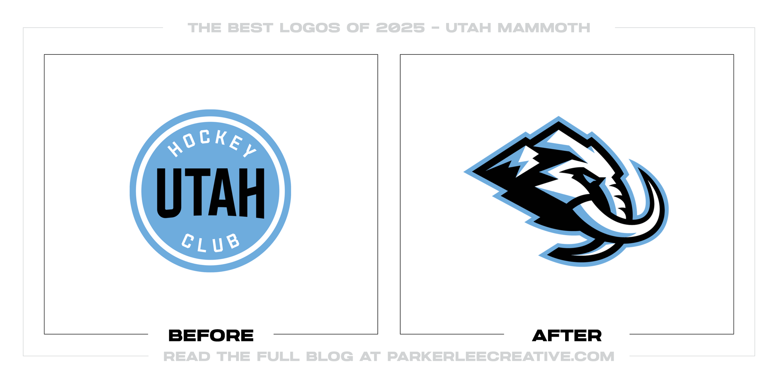
#1 - Utah Mammoth
Utah’s identity pivot finally gives the franchise a true “sports mark,” replacing a placeholder-style look with a bold, ownable mascot built for merch, helmets, and broadcast. The redesign works because it commits to a clear concept, simplifies into a readable silhouette, and creates instant recognition at game-speed.
Why It Made the List:
• The mark chooses a single, memorable idea and executes it with confidence, which is exactly how sports logos build fan recall across hats, patches, and social avatars.
• The geometry reads clean at small sizes while still feeling aggressive and premium, proving the design was built for real-world application, not just presentation slides.
• The system creates room for alternates and extensions without weakening the core, which is how modern teams stay consistent across seasons and campaigns.
Logos and trademarks are the property of their respective owners and are shown for identification and commentary purposes only; no endorsement is implied.
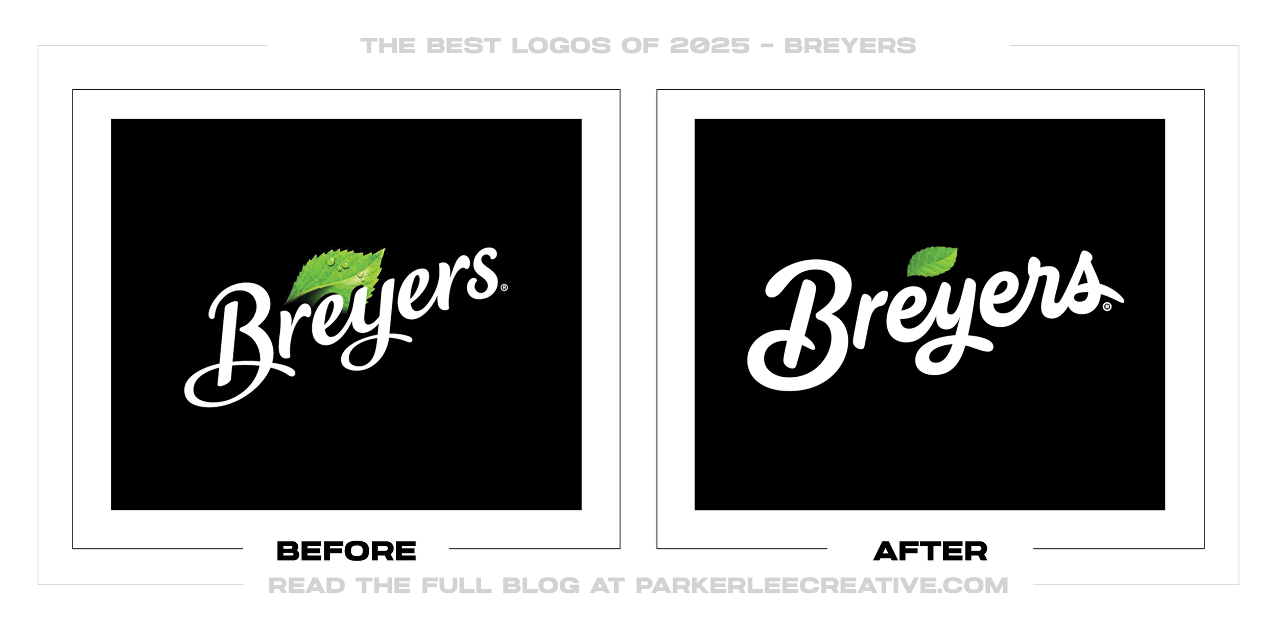
#2 - Breyers
Breyers’ update keeps the brand’s classic familiarity while refining the details that matter most on packaging: clarity, balance, and a more confident wordmark. The redesign succeeds because it modernizes without erasing equity, making the logo feel cleaner and rememberable without feeling “new for the sake of new.”
Why It Made the List:
• The refined letterforms improve readability on crowded shelves, especially at a distance, where small typographic issues quickly turn into lost recognition.
• The update protects the brand’s heritage cues while streamlining them into a more scalable system, which is the sweet spot for legacy food brands.
• The overall polish feels intentional and premium, helping the logo hold its own across digital thumbnails, cartons, and multipack layouts.
Logos and trademarks are the property of their respective owners and are shown for identification and commentary purposes only; no endorsement is implied.
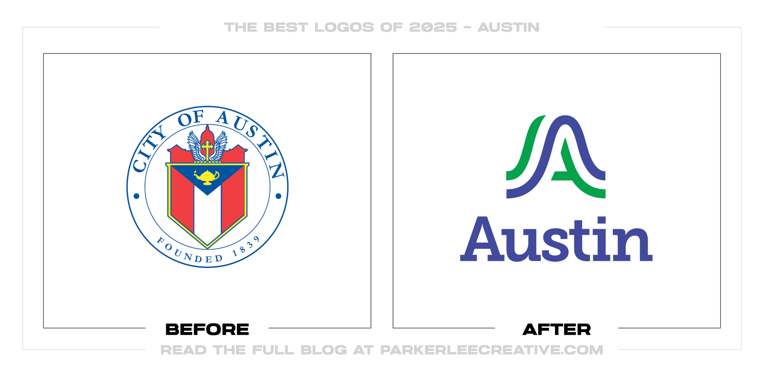
#3 - Austin, Texas
Austin’s refresh moves away from civic complexity and toward a modern city mark that can actually function across departments, signage, and digital experiences. The redesign works because it creates a simpler, more flexible symbol that can live as a standalone icon while still feeling distinctly “Austin.”
Why It Made the List:
• The new mark improves scalability dramatically, which is essential for municipal systems that must work from tiny web headers to large-format wayfinding.
• The symbol is simple enough to be consistent, yet unique enough to be ownable, avoiding the “generic city swoosh” problem many civic rebrands fall into.
• The system is built to extend, making it easier to unify city communications without forcing every use case into a rigid, seal-based layout.
Logos and trademarks are the property of their respective owners and are shown for identification and commentary purposes only; no endorsement is implied.
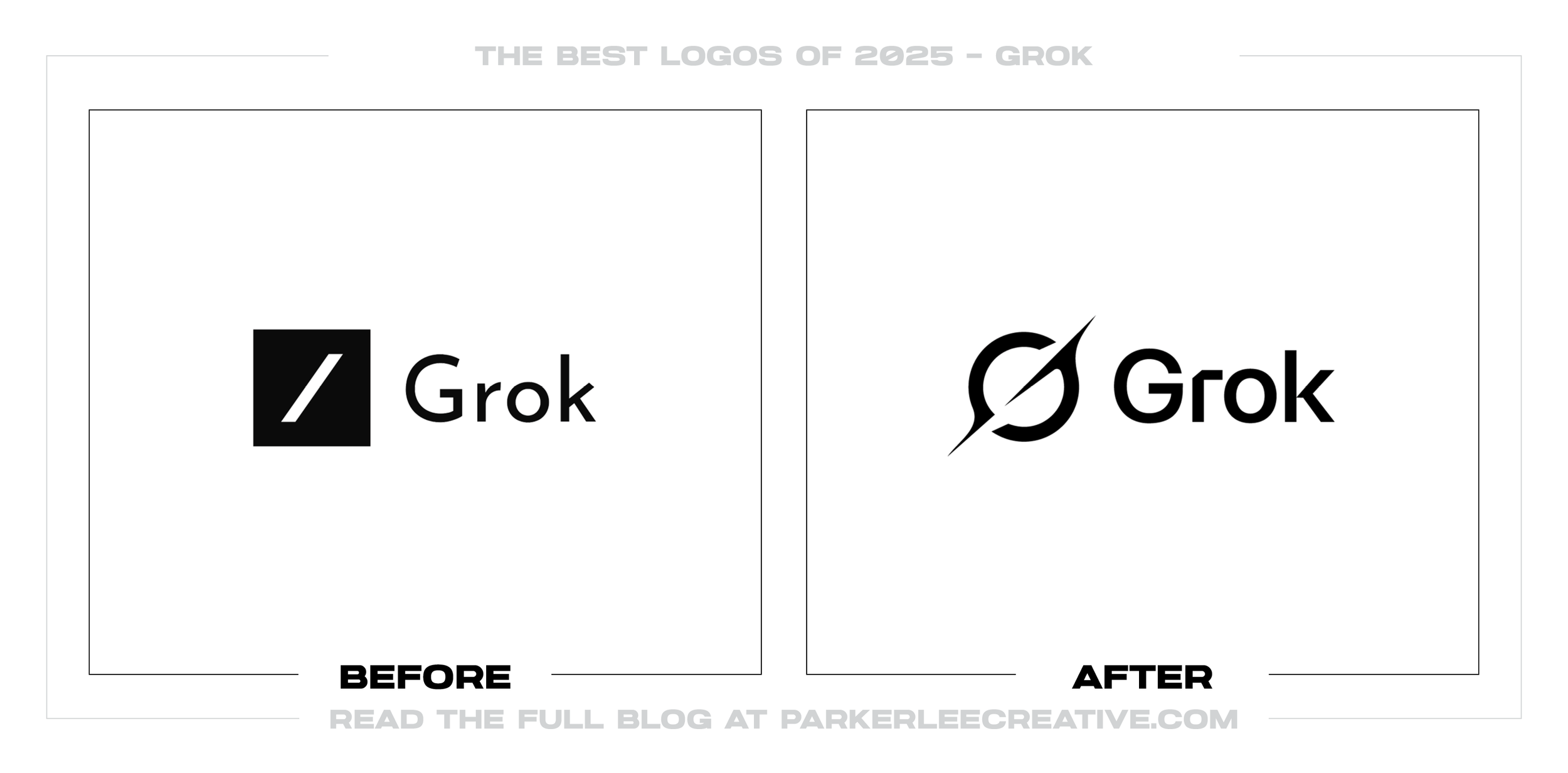
#4 - Grok
Grok’s identity evolution tightens the brand into something clearer, more app-friendly, and more recognizable at a glance. The redesign succeeds because it prioritizes a strong icon silhouette and a cleaner wordmark relationship, making the brand easier to spot in fast-scroll environments.
Why It Made the List:
• The icon is designed for the realities of modern UI, with a bold, simple shape that survives small sizes and dark-mode usage.
• The updated typography feels more deliberate and product-ready, which helps the brand read as stable and established instead of experimental.
• The overall system feels cohesive, reducing visual noise and improving recognition across icons, lockups, and brand moments.
Logos and trademarks are the property of their respective owners and are shown for identification and commentary purposes only; no endorsement is implied.
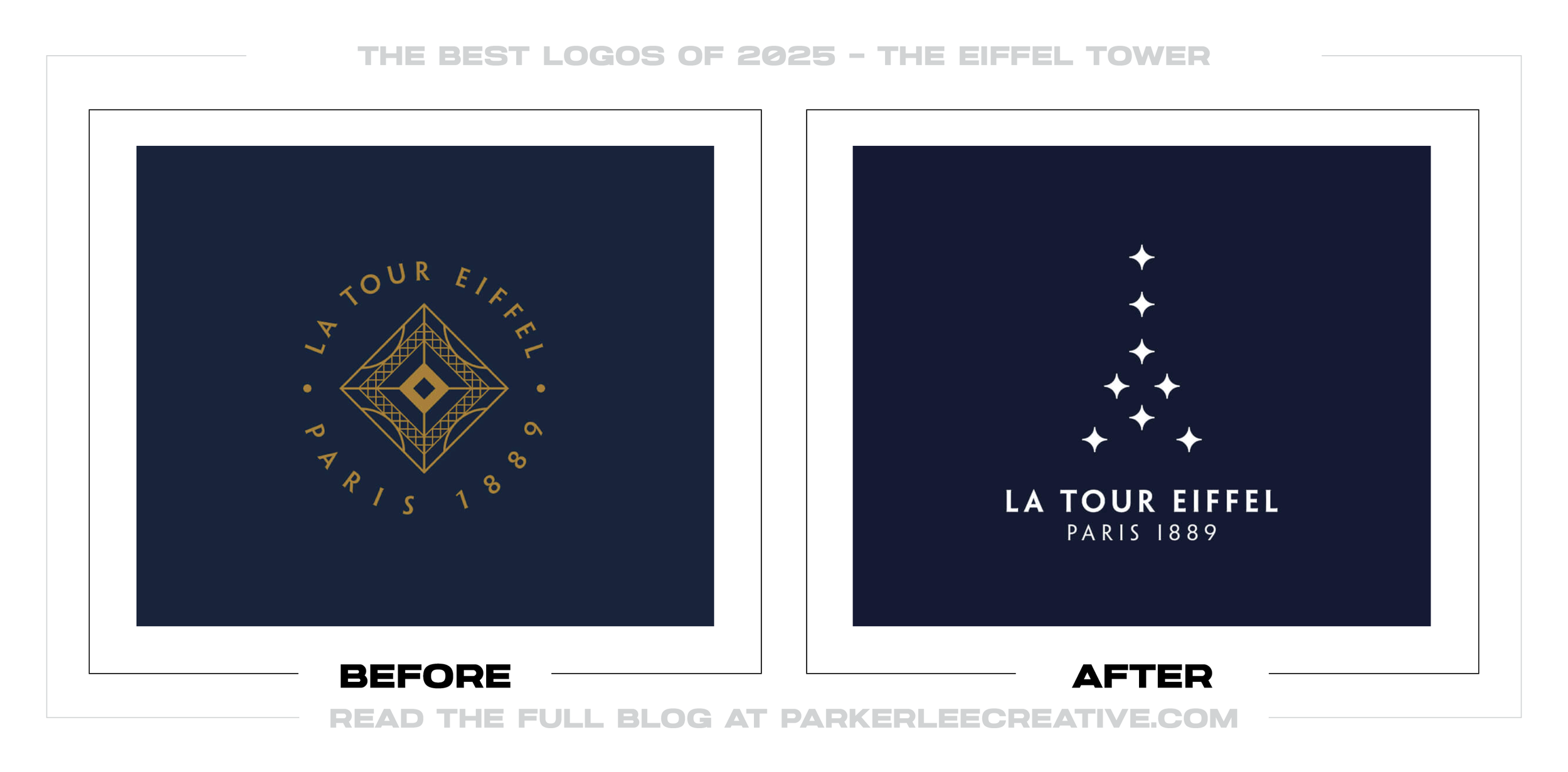
#5 - The Eiffel Tower
The Eiffel Tower’s updated mark proves that simplification can still feel iconic when the underlying concept is strong. The redesign works because it reduces complexity into a cleaner, more geometric symbol while keeping the romance and prestige the brand depends on.
Why It Made the List:
• The simplified silhouette is more legible and reproducible, which is critical for tourism, signage, and global merchandising.
• The geometry feels intentional and refined, giving the identity a premium finish without drifting into generic minimalism.
• The system balances heritage with modern clarity, letting the brand feel timeless instead of trapped in ornamental detail.
Logos and trademarks are the property of their respective owners and are shown for identification and commentary purposes only; no endorsement is implied.
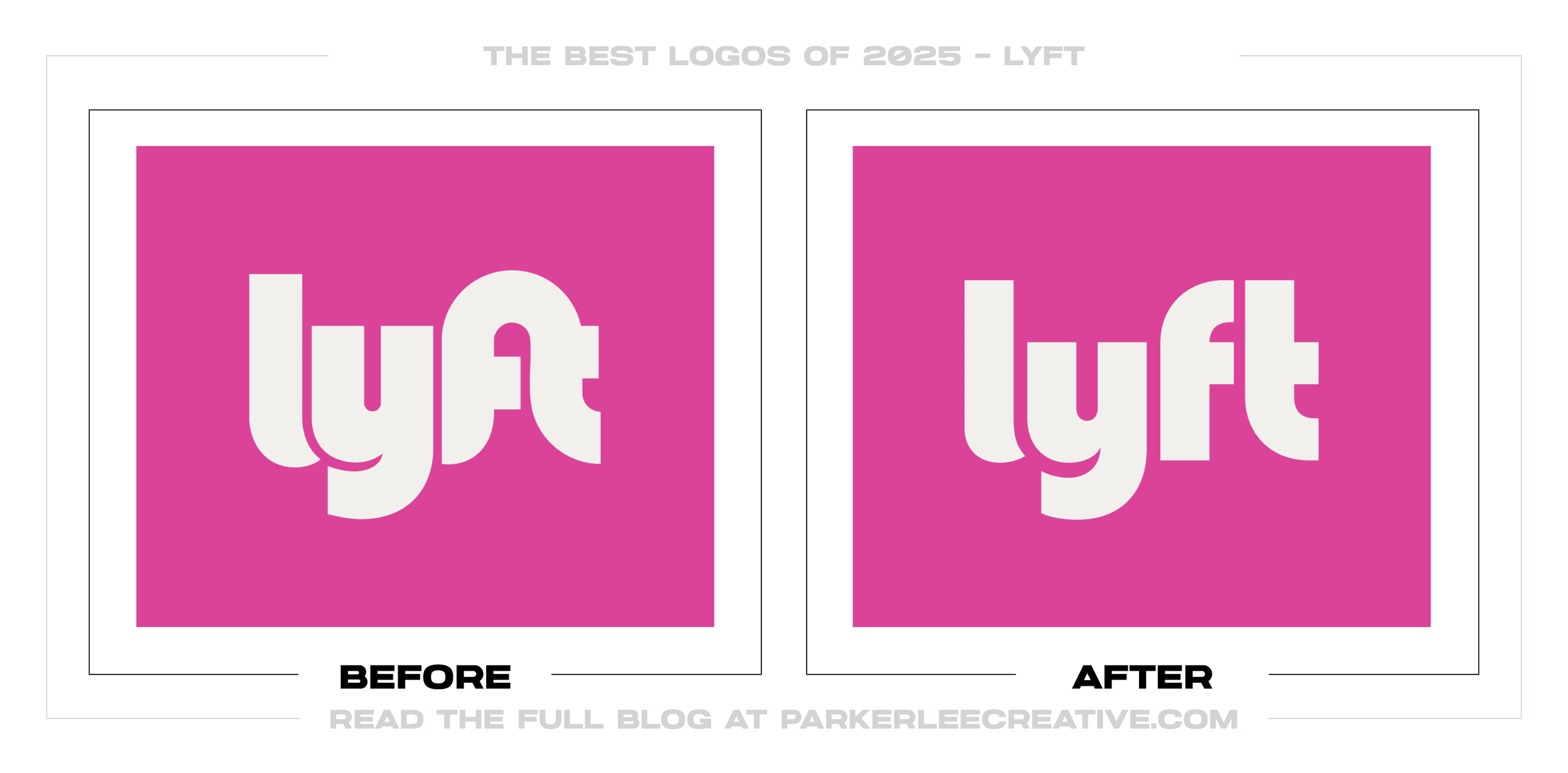
#6 - Lyft
Lyft’s update is a reminder that small typographic decisions can dramatically improve a brand’s confidence and readability. The redesign succeeds because it cleans up letterform quirks and spacing, resulting in a wordmark that feels more stable, polished, and scalable.
Why It Made the List:
• The refined shapes improve legibility in motion and in-app, where ride-share brands live most of the time.
• The wordmark feels more mature without losing approachability, which is exactly what a mainstream consumer service needs as it scales.
• The design keeps the brand recognizable while eliminating softness that could make the logo feel less premium next to competitors.
Logos and trademarks are the property of their respective owners and are shown for identification and commentary purposes only; no endorsement is implied.
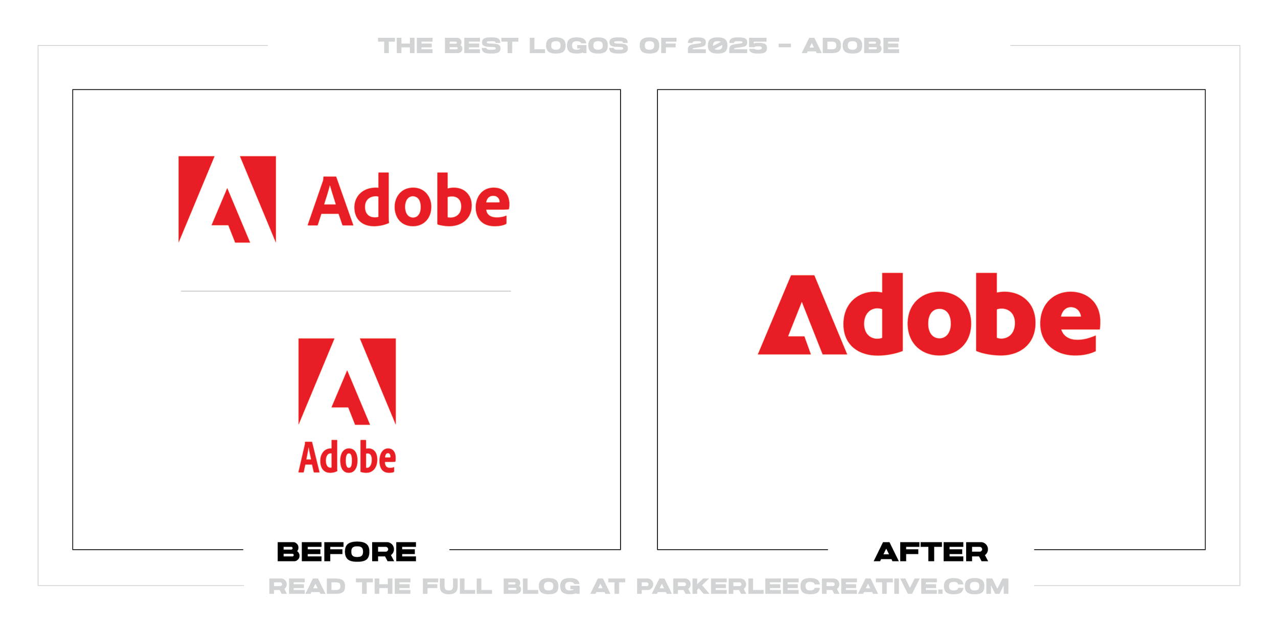
#7 - Adobe
Adobe’s refresh leans into maximum simplicity while staying unmistakably Adobe. The redesign works because it reduces reliance on a separate symbol lockup and strengthens the wordmark into something that can stand alone with confidence.
Why It Made the List:
• The wordmark is built to perform across product ecosystems, making it easier to apply consistently across dozens of apps and touchpoints.
• The simplified approach improves flexibility in UI and motion, where clean geometry and strong spacing make brands feel sharper.
• The brand’s equity remains intact, proving the update was refinement-driven, not trend-chasing.
Logos and trademarks are the property of their respective owners and are shown for identification and commentary purposes only; no endorsement is implied.
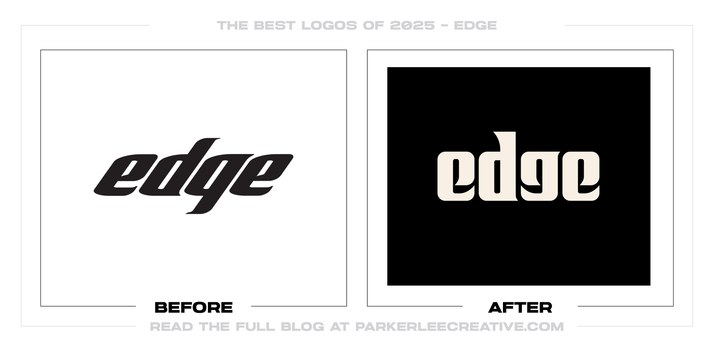
#8 - Edge
Edge’s new wordmark direction feels bolder and more intentional, shifting the brand into a more distinctive, editorial-feeling space. The redesign succeeds because it embraces stronger typography that reads with confidence across digital and print applications.
Why It Made the List:
• The heavier, more character-forward letterforms improve recognition and give the brand a more ownable visual voice.
• The mark is designed to hold up in high-contrast environments, which helps in everything from thumbnails to large-format placements.
• The typography choice signals a clearer personality, making the brand feel less interchangeable in a sea of clean sans-serif identities.
Logos and trademarks are the property of their respective owners and are shown for identification and commentary purposes only; no endorsement is implied.
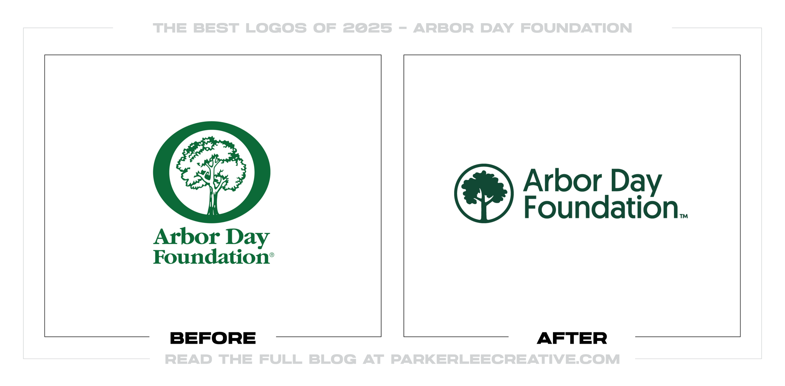
#9 - Arbor Day Foundation
Arbor Day Foundation’s update modernizes the identity while keeping the meaning immediately clear. The redesign works because it simplifies the tree symbolism into a cleaner, more reproducible mark and pairs it with typography that feels current and credible.
Why It Made the List:
• The icon is simpler and more scalable, which helps the brand stay consistent across fundraising, education, and partnership materials.
• The updated wordmark improves clarity and professionalism, reinforcing trust for an organization that depends on credibility.
• The system retains warmth and mission clarity without falling into cliché, keeping the brand approachable and memorable.
Logos and trademarks are the property of their respective owners and are shown for identification and commentary purposes only; no endorsement is implied.
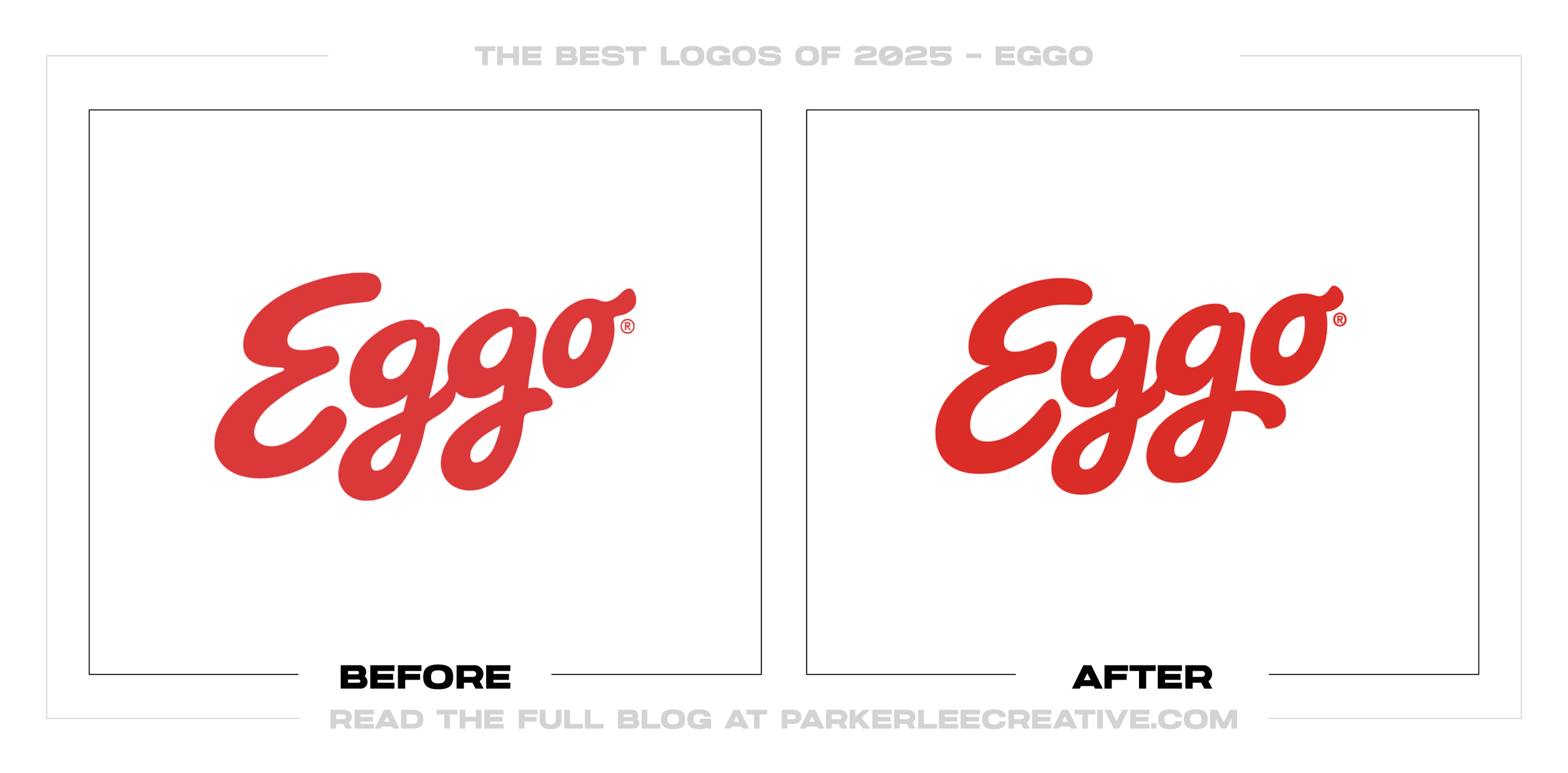
#10 - Eggo
Eggo’s refresh keeps the playful equity people recognize while tightening the details for modern packaging and digital. The redesign succeeds because it strengthens the wordmark’s clarity and consistency without losing the brand’s friendly energy.
Why It Made the List:
• The refinements improve readability on the shelf and in thumbnails, where food brands win or lose attention in seconds.
• The updated letterforms feel cleaner and more intentional, helping the brand look sharper without becoming sterile.
• The system protects what matters most: instant recognition, even when the logo is small or surrounded by busy flavor messaging.
Logos and trademarks are the property of their respective owners and are shown for identification and commentary purposes only; no endorsement is implied.
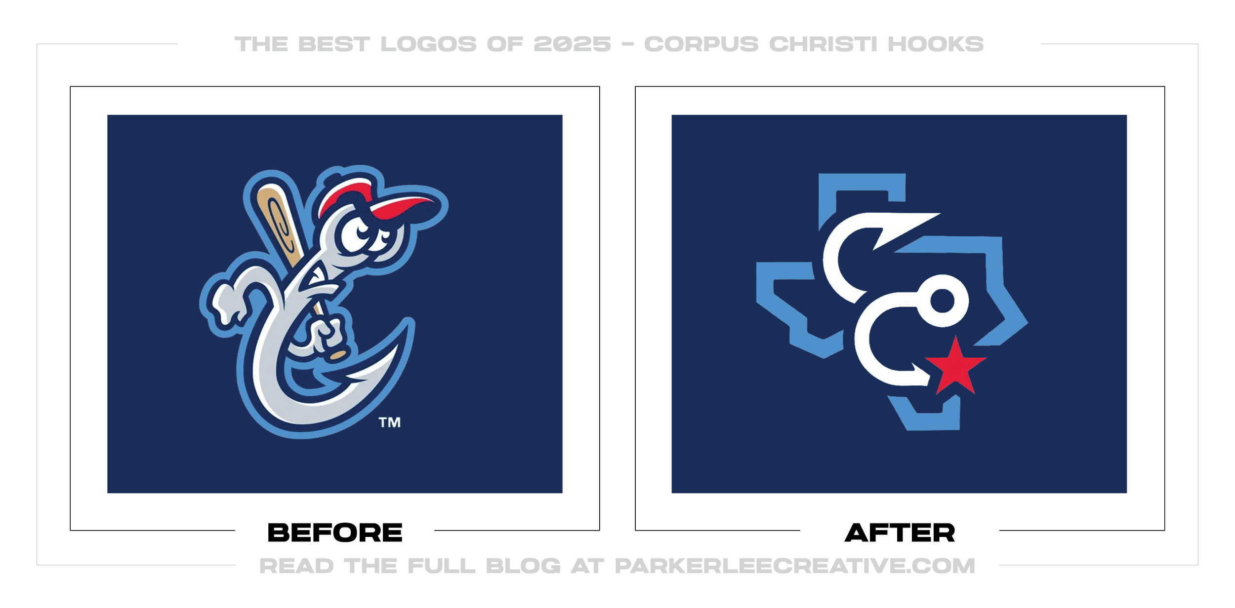
#11 - Corpus Christi Hooks
The Hooks’ update is a smart shift toward a more versatile, merch-ready identity that still feels rooted in place. The redesign works because it creates a stronger core mark that can live cleanly on hats, jerseys, and social without relying on heavy illustration.
Why It Made the List:
• The simplified form improves reproducibility, which is essential for sports branding across embroidery, patches, and broadcast graphics.
• The design feels more iconic and less busy, making recognition faster and cleaner at a distance.
• The system is better built for alternate marks and lockups, giving the team a fuller identity toolkit without diluting the primary logo.
Logos and trademarks are the property of their respective owners and are shown for identification and commentary purposes only; no endorsement is implied.
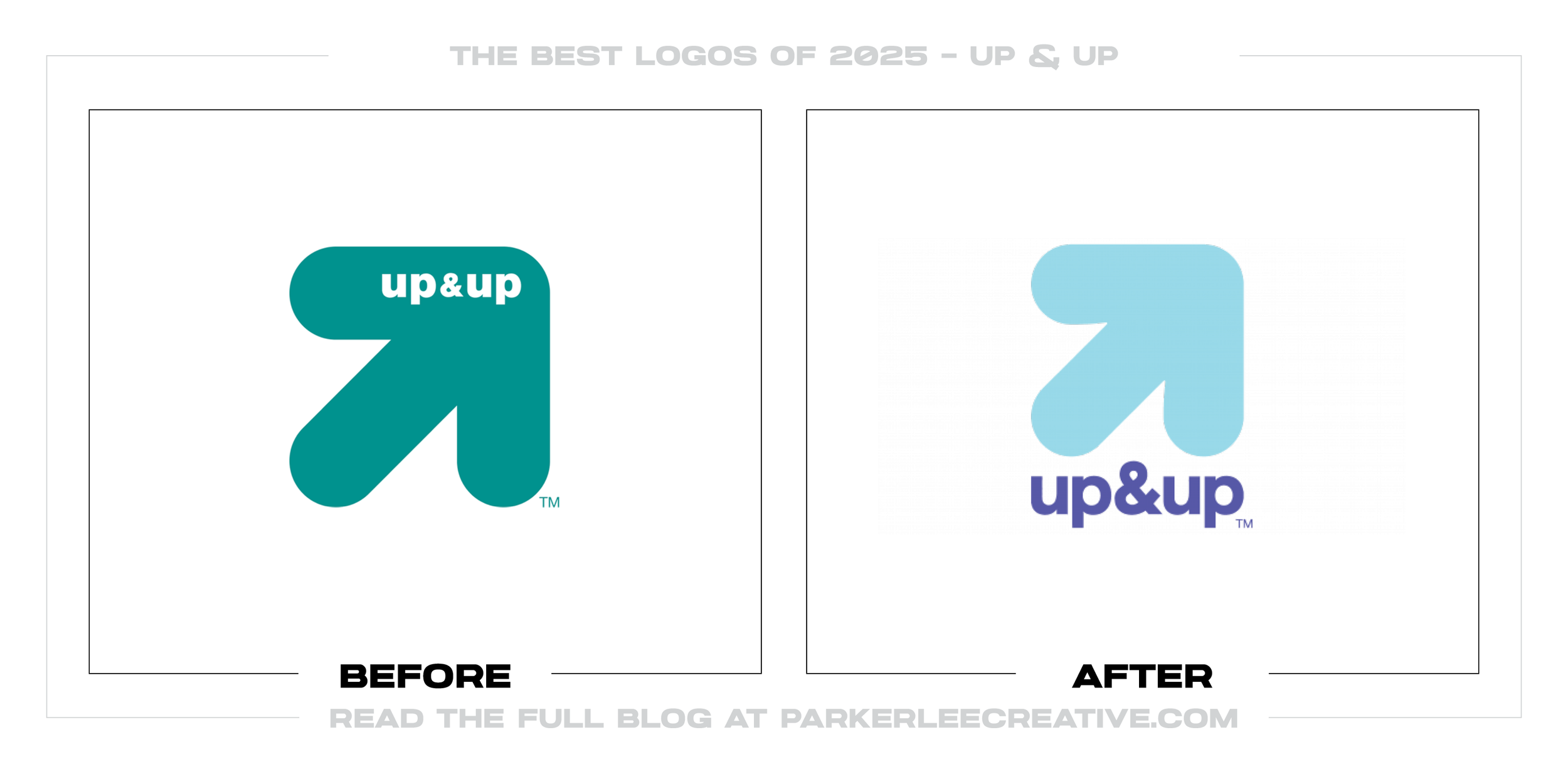
#12 - Up & Up
Up & Up’s update strengthens the brand by improving the balance between icon and wordmark while keeping the upbeat, directional concept intact. The redesign succeeds because it feels cleaner, bolder, and easier to deploy consistently across packaging and digital retail.
Why It Made the List:
• The icon reads faster and more confidently, which matters when private-label brands compete in cluttered category shelves and search results.
• The typography feels sturdier and more modern, helping the brand look more credible without losing its approachable tone.
• The overall system is easier to scale across thousands of SKUs, which is where functional design decisions pay off most.
Logos and trademarks are the property of their respective owners and are shown for identification and commentary purposes only; no endorsement is implied.
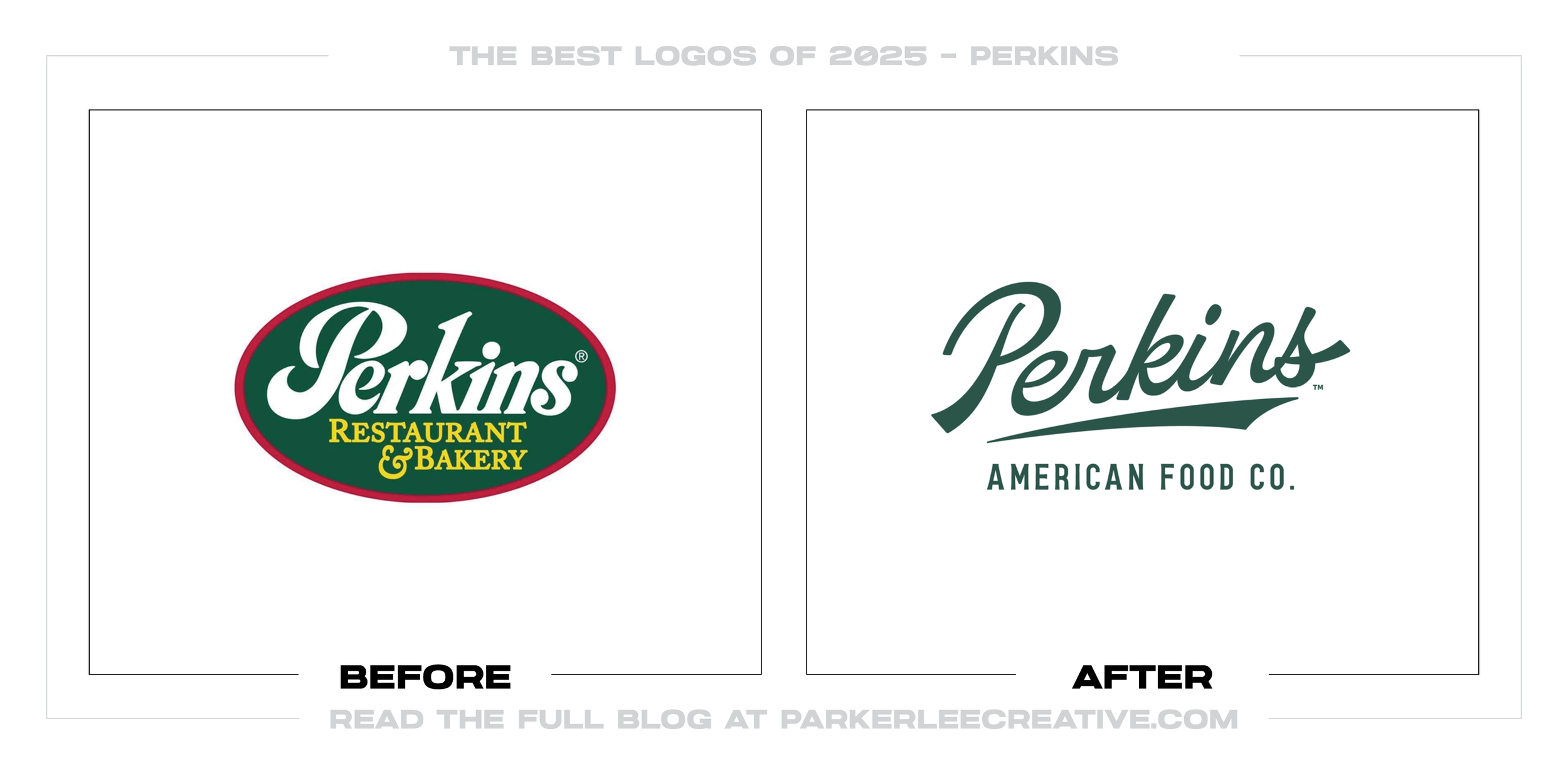
#13 - Perkins
Perkins’ refresh brings the brand back to a clear, classic, diner-forward identity with stronger typography and a cleaner hierarchy. The redesign works because it makes the name the hero, reduces clutter, and sets the brand up for consistent signage and packaging.
Why It Made the List:
• The wordmark feels more intentional and recognizable, helping the brand stand out in a category full of similar “comfort food” competitors.
• The hierarchy is clearer, which improves readability across storefront signs, menus, and digital ordering platforms.
• The system modernizes without losing warmth, keeping the brand’s heritage appeal while upgrading its execution.
Logos and trademarks are the property of their respective owners and are shown for identification and commentary purposes only; no endorsement is implied.
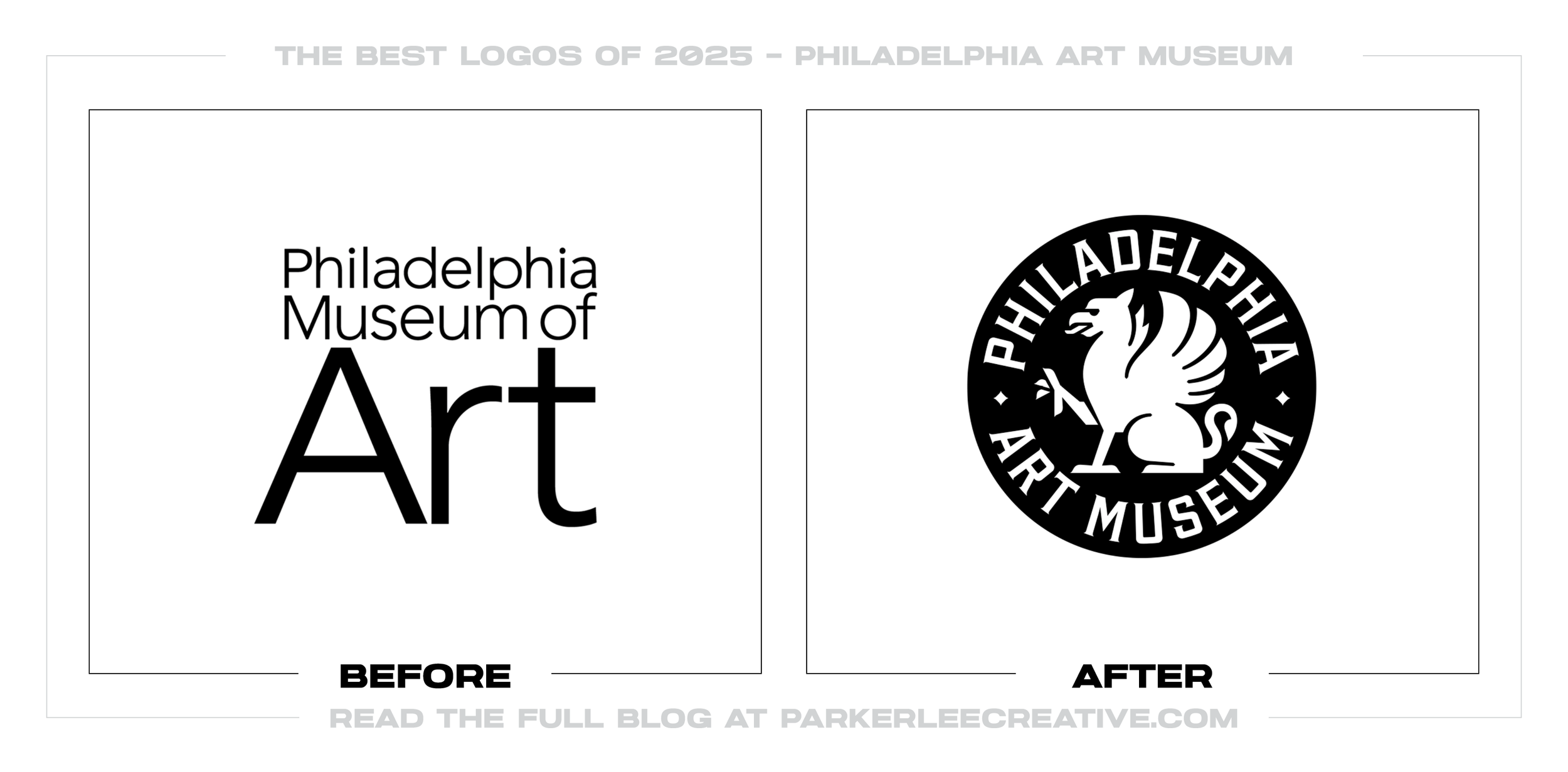
#14 - Philadelphia Art Museum
Philadelphia Art Museum’s update feels more iconic and institutional, giving the organization a mark that can scale across exhibitions, retail, and wayfinding. The redesign succeeds because it leans into a stronger emblem-style approach while maintaining clarity and balance.
Why It Made the List:
• The new structure feels more ownable and museum-like, reinforcing authority and prestige without overcomplicating the design.
• The mark is more flexible across applications, especially for signage and exhibition branding that needs a strong “stamp” presence.
• The overall identity reads more cohesive, making it easier for the museum to present a unified brand across programs and collections.
Logos and trademarks are the property of their respective owners and are shown for identification and commentary purposes only; no endorsement is implied.
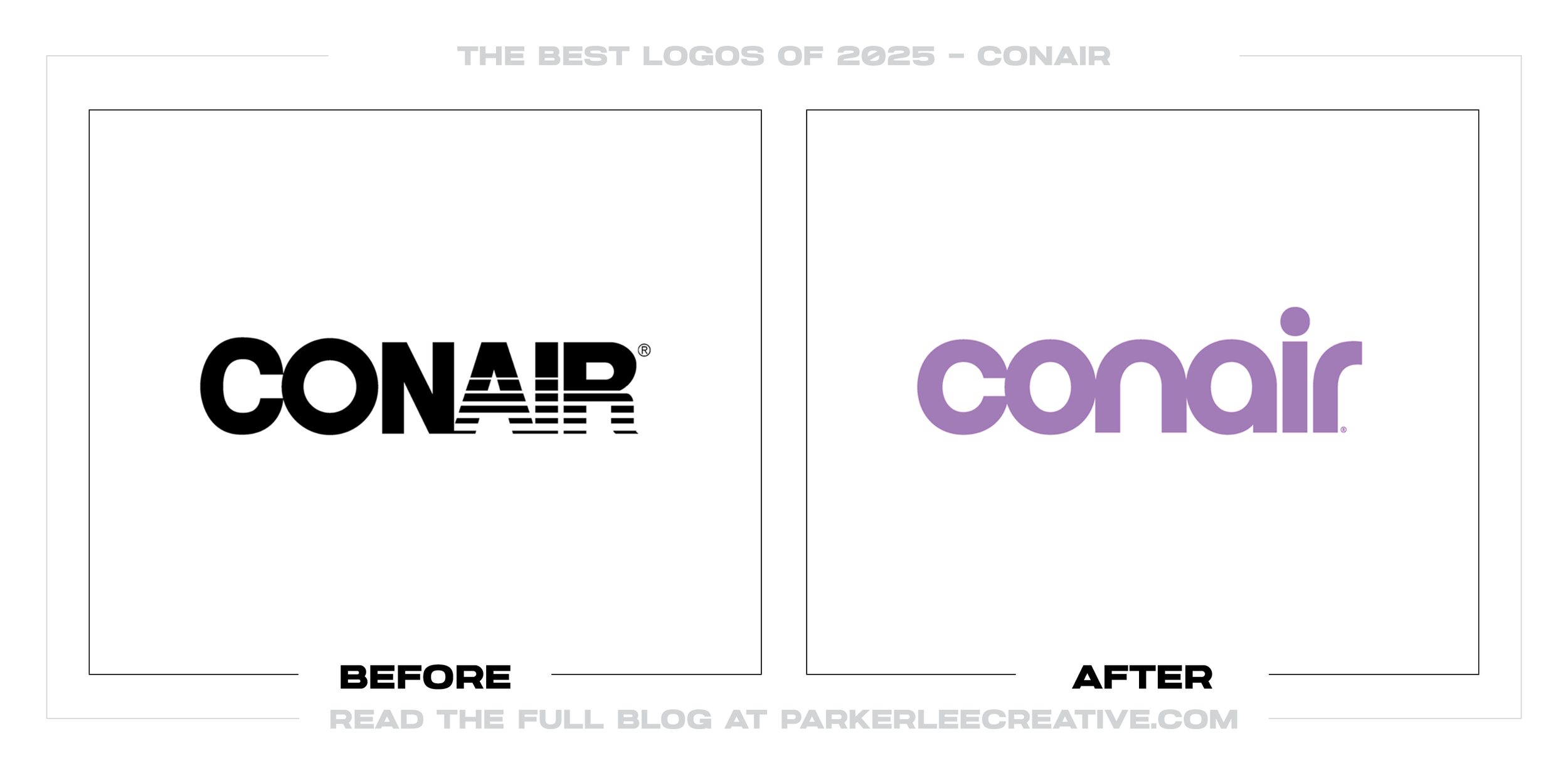
#15 - Conair
Conair’s refresh is a strong example of how softer typography can still feel premium when it is executed with control. The redesign works because it modernizes the brand into a cleaner, more contemporary wordmark that aligns better with beauty and personal-care expectations.
Why It Made the List:
• The updated letterforms feel more current and approachable, helping the brand feel less dated on shelf and in digital marketplaces.
• The simplified mark is more adaptable across product lines, where consistency is key for a portfolio brand.
• The design elevates perceived quality without leaning on trends, which is how personal-care brands stay relevant long-term.
Logos and trademarks are the property of their respective owners and are shown for identification and commentary purposes only; no endorsement is implied.
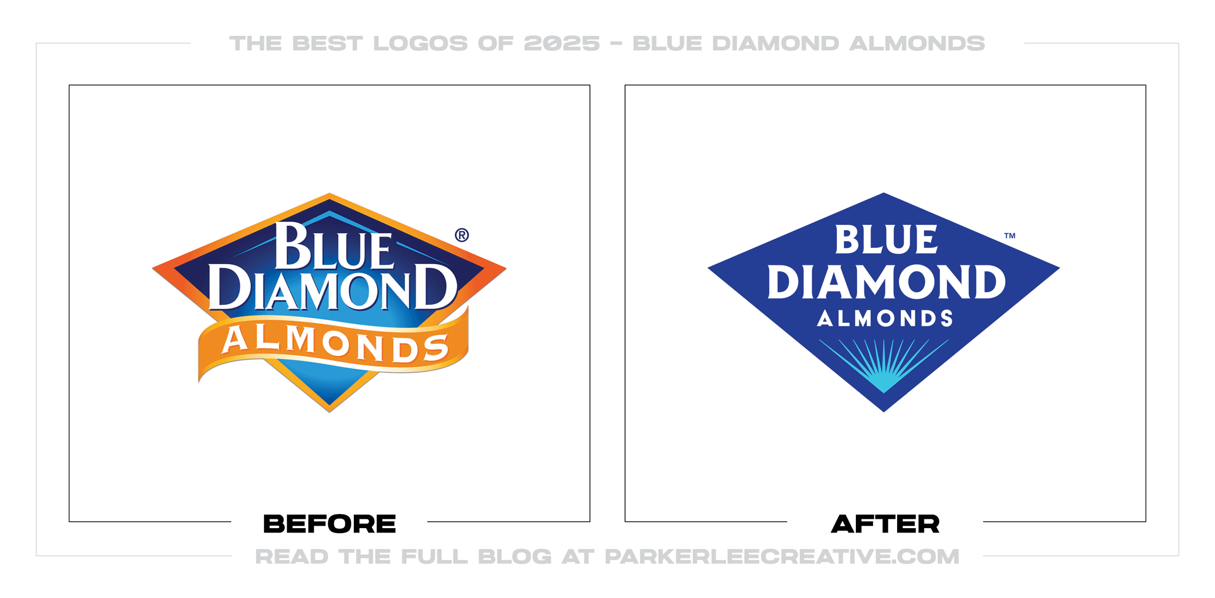
#16 - Blue Diamond Almonds
Blue Diamond’s update simplifies the brand into a more modern, scalable system while keeping the core diamond equity intact. The redesign succeeds because it reduces visual noise, strengthens the symbol, and improves clarity for packaging and digital retail.
Why It Made the List:
• The simplified icon improves legibility and reproduction, especially across small packaging placements and fast-scroll shopping contexts.
• The system feels cleaner and more contemporary, helping the brand look premium without abandoning recognition cues.
• The update creates stronger hierarchy potential across flavors and sublines, which is where a packaging-heavy brand benefits most.
Logos and trademarks are the property of their respective owners and are shown for identification and commentary purposes only; no endorsement is implied.
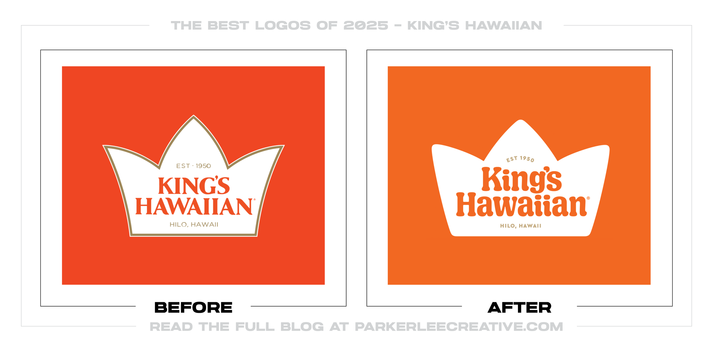
#17 - King’s Hawaiian
King’s Hawaiian refreshes its identity in a way that feels both more modern and more confident, tightening details without losing its signature charm. The redesign works because it strengthens the core emblem and typography into something more consistent and versatile across packaging.
Why It Made the List:
• The icon and type feel more cohesive, making the brand easier to recognize quickly across shelves and online listings.
• The refinements improve scalability, which matters for everything from bread bags to social campaigns and seasonal editions.
• The brand keeps its personality, proving the update was about clarity and craftsmanship, not stripping the brand down to nothing.
Logos and trademarks are the property of their respective owners and are shown for identification and commentary purposes only; no endorsement is implied.
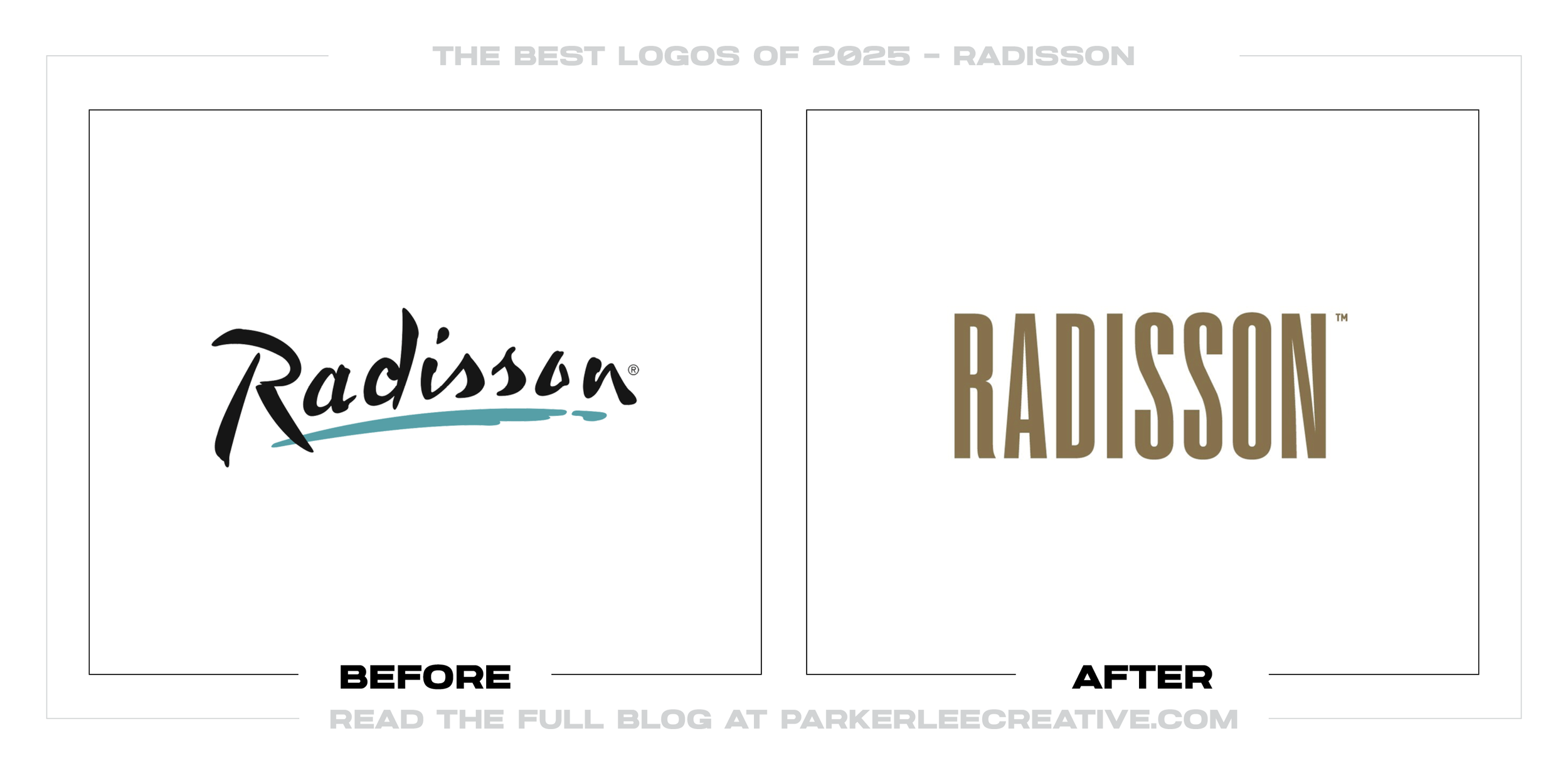
#18 - Radisson
Radisson’s update brings a cleaner, more contemporary hospitality feel while maintaining the brand’s recognizable cues. The redesign succeeds because it improves typography, simplifies the icon language, and better supports a modern hotel portfolio across signage and digital booking.
Why It Made the List:
• The simplified form improves legibility on signage, where hotel brands must read instantly from a distance and at speed.
• The typography feels more premium and current, aligning better with guest expectations in an increasingly design-conscious category.
• The system is more flexible for sub-brands and locations, helping Radisson stay consistent without forcing one rigid lockup everywhere.
Logos and trademarks are the property of their respective owners and are shown for identification and commentary purposes only; no endorsement is implied.
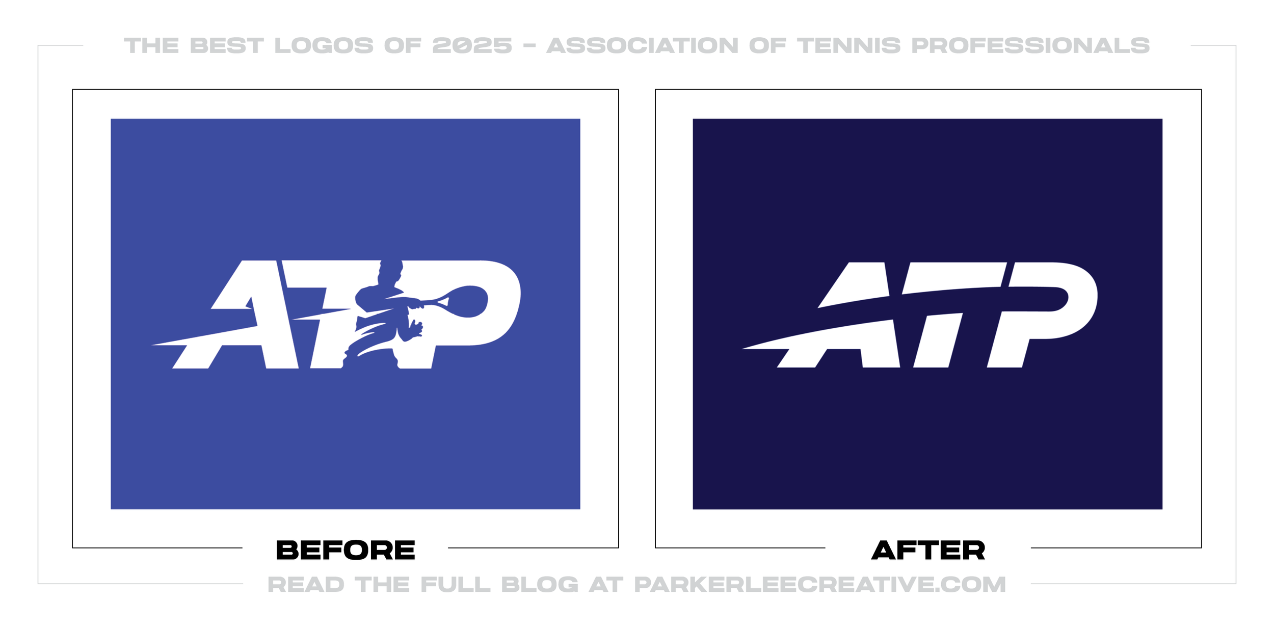
#19 - Association of Tennis Professionals
ATP’s update is a clean, confident modernization that prioritizes clarity and performance across broadcast, apparel, and digital. The redesign works because it simplifies the brand into a stronger, more athletic wordmark that feels faster and more iconic.
Why It Made the List:
• The new mark reads better at small sizes, which is crucial for scorebugs, social graphics, and app icons.
• The typography communicates speed and professionalism, matching the energy of the sport without relying on dated athlete silhouettes.
• The identity feels more globally consistent, helping ATP present a unified look across tournaments, media, and partnerships.
Logos and trademarks are the property of their respective owners and are shown for identification and commentary purposes only; no endorsement is implied.
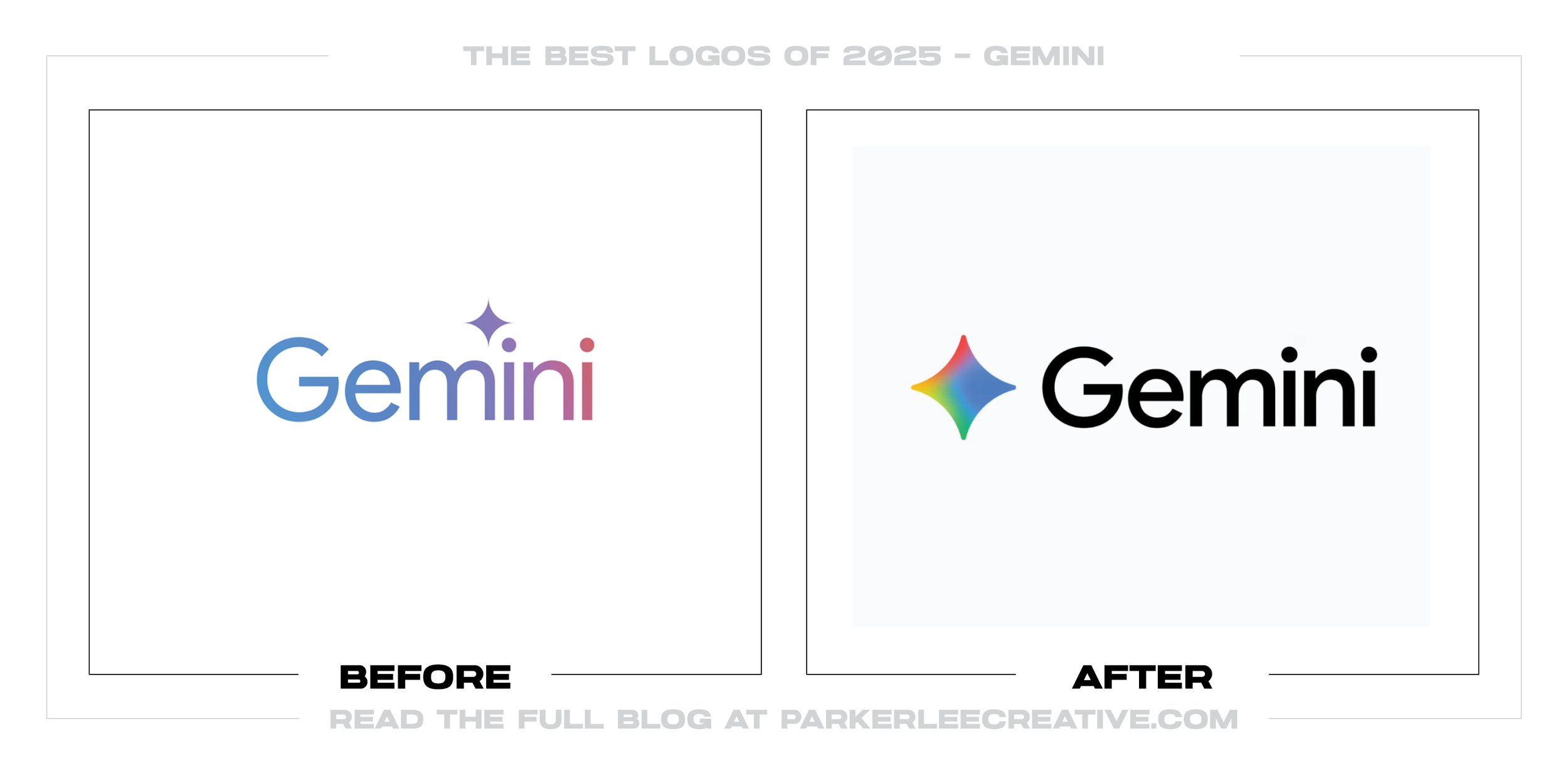
#20 - Gemini
Gemini’s refresh tightens the brand into a clearer, more flexible system built for product ecosystems. The redesign succeeds because it improves contrast, strengthens icon presence, and makes the wordmark feel more stable and usable across real interfaces.
Why It Made the List:
• The icon is more recognizable and app-ready, improving performance in the exact contexts where AI brands are discovered and compared.
• The typography feels cleaner and more confident, which helps the brand read as trustworthy and mature instead of experimental.
• The system balances personality and restraint, avoiding both generic minimalism and over-stylized novelty.
Logos and trademarks are the property of their respective owners and are shown for identification and commentary purposes only; no endorsement is implied.
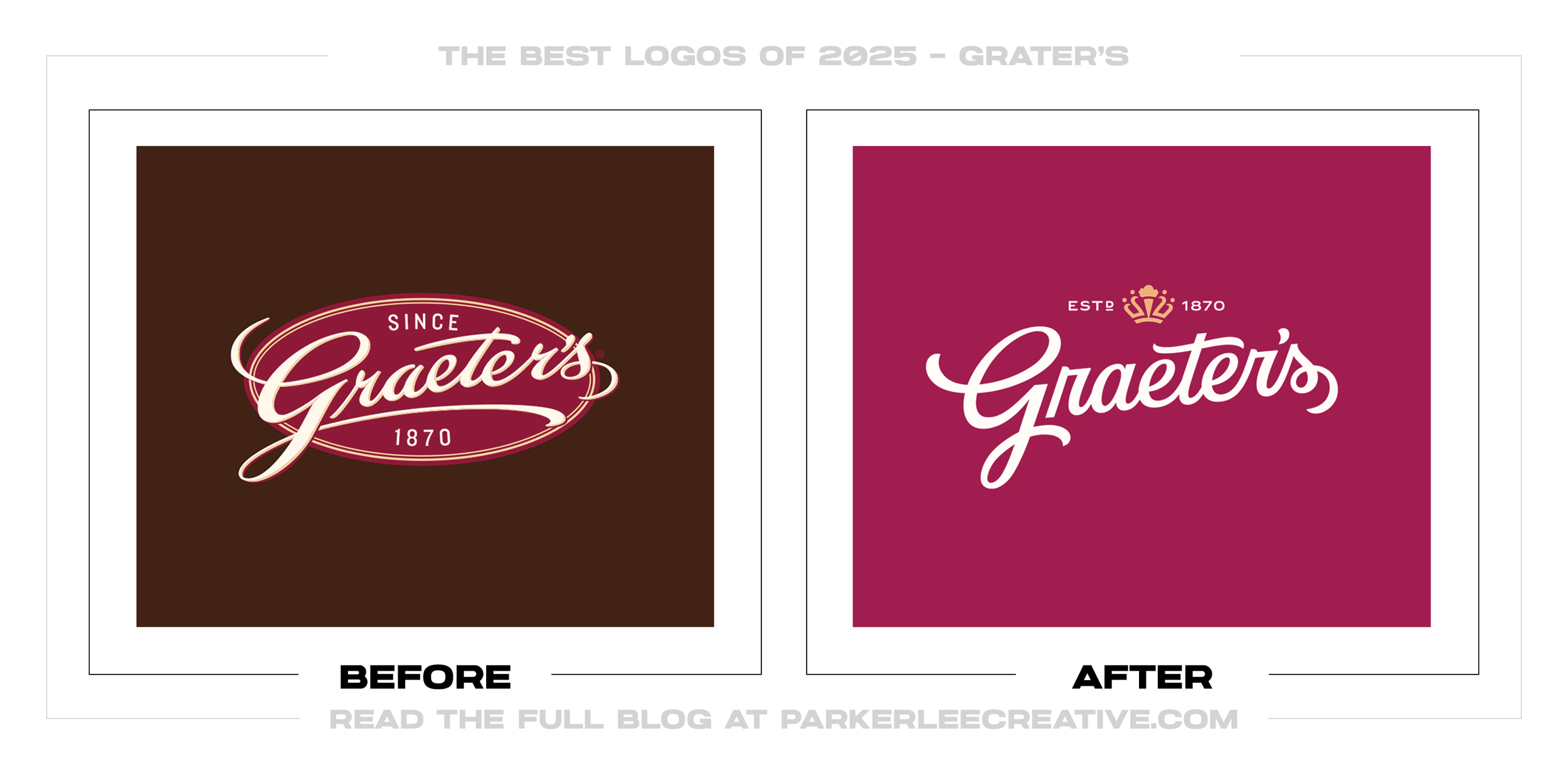
#21 - Graeter’s
Graeter’s update is a masterclass in heritage refinement, keeping the brand’s classic charm while improving clarity and scalability. The redesign works because it strengthens the script presence, simplifies supporting elements, and feels more premium across packaging.
Why It Made the List:
• The simplified layout improves legibility while protecting the brand’s signature, which is essential for long-standing, nostalgic food brands.
• The refinements feel crafted, not trendy, making the identity more timeless and less likely to date quickly.
• The system better supports modern packaging needs without losing the warmth and tradition that customers associate with the brand.
Logos and trademarks are the property of their respective owners and are shown for identification and commentary purposes only; no endorsement is implied.
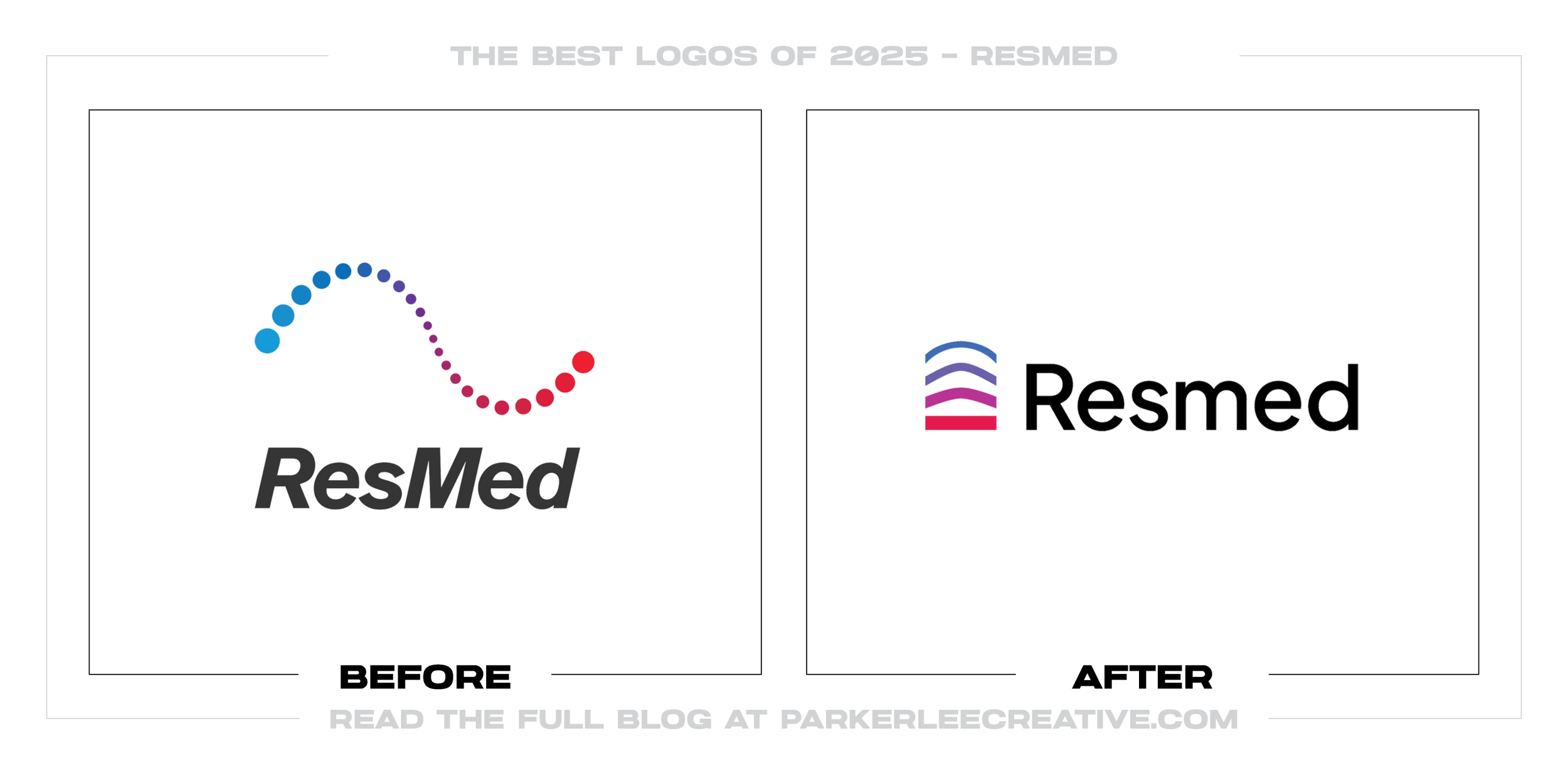
#22 - Resmed
ResMed’s refresh is clean, confident, and significantly more modern, aligning the brand with today’s health-tech expectations. The redesign succeeds because it simplifies the visual language, improves typography, and creates a mark that scales easily.
Why It Made the List:
• The updated system feels more credible and contemporary, which matters in healthcare where trust is part of the brand promise.
• The icon and wordmark relationship is clearer, improving consistency across clinical products, consumer channels, and digital platforms.
• The design reduces complexity without losing identity, making the brand easier to recognize and easier to deploy correctly.
Logos and trademarks are the property of their respective owners and are shown for identification and commentary purposes only; no endorsement is implied.
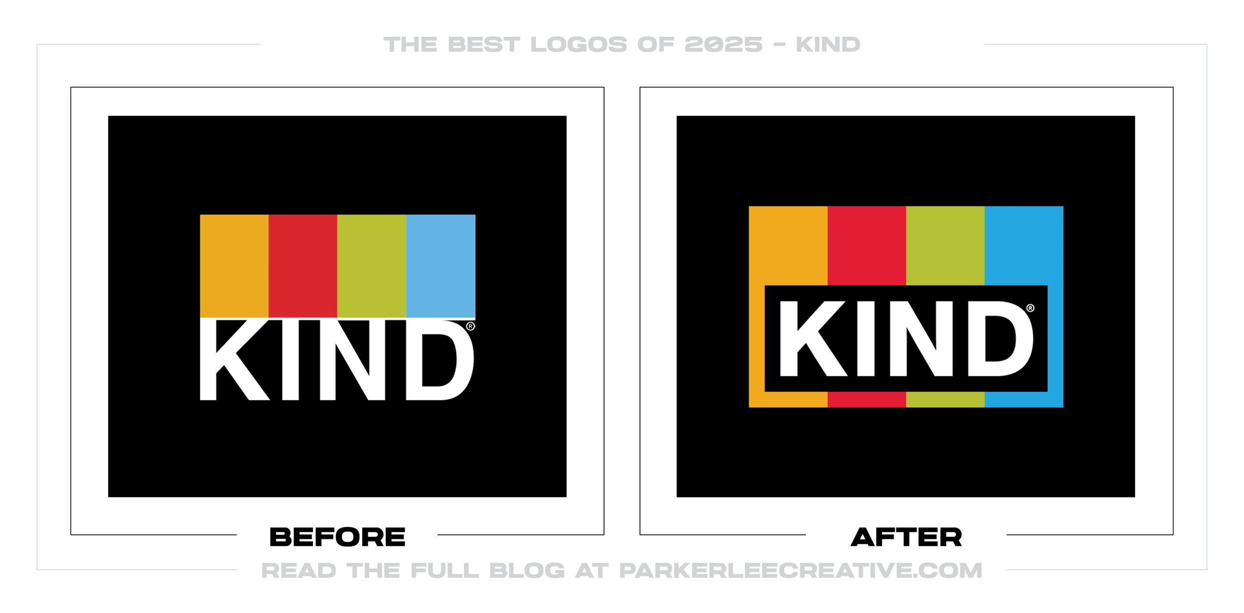
#23 - Kind
KIND’s update strengthens brand impact by improving the framing, hierarchy, and overall presence of the logo in real packaging contexts. The redesign works because it makes the mark feel bolder, more intentional, and more consistent across flavors and formats.
Why It Made the List:
• The new framing increases contrast and readability, helping the brand stand out quickly in crowded snack aisles and digital shelves.
• The system feels more structured and scalable, which is critical for a brand that lives across many SKUs and seasonal variants.
• The identity maintains the recognizable color-block equity while upgrading execution, proving the refresh was strategic, not cosmetic.
Logos and trademarks are the property of their respective owners and are shown for identification and commentary purposes only; no endorsement is implied.
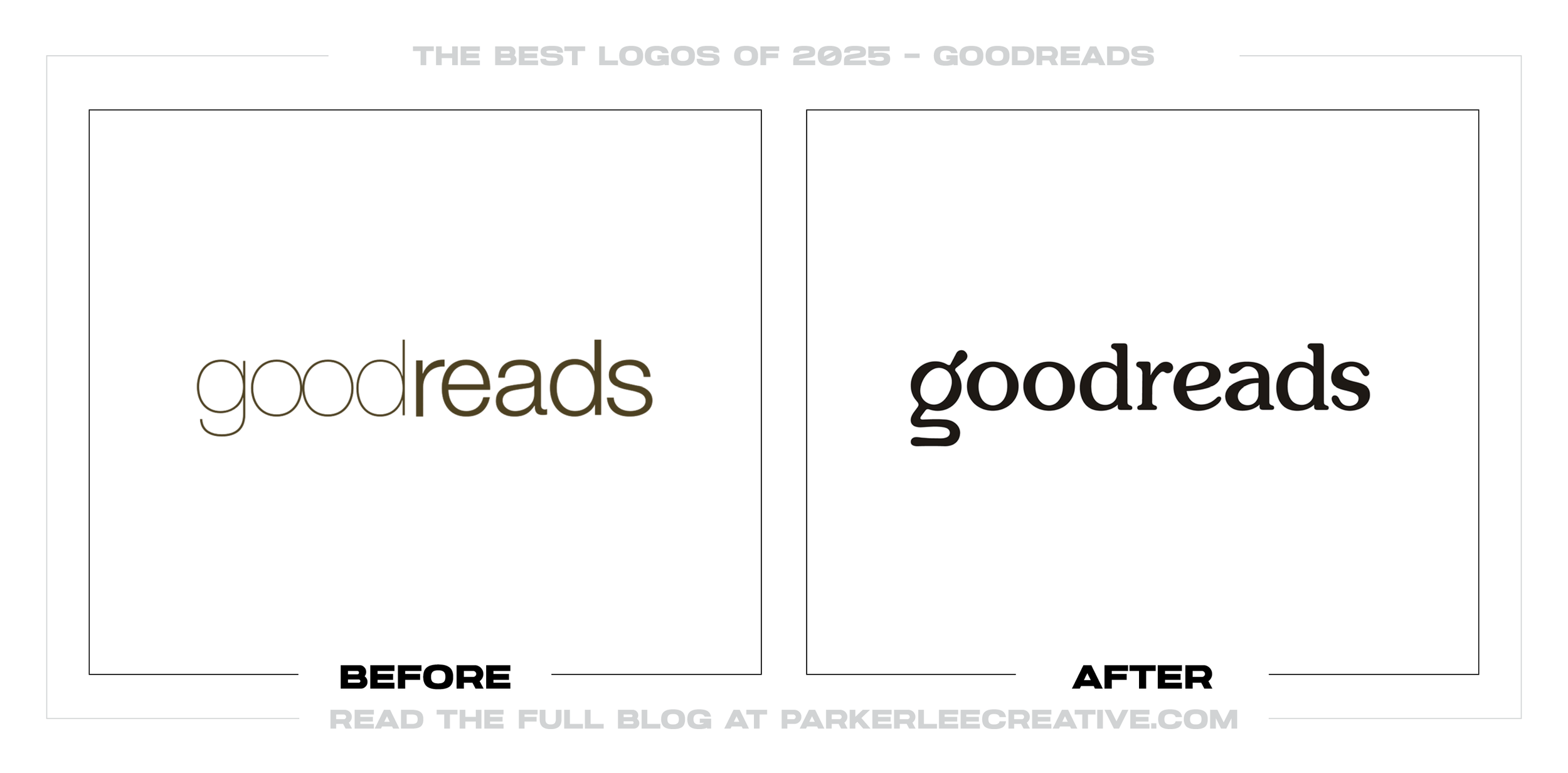
#24 - Good Reads
Goodreads’ update is a strong example of how typography alone can reshape a brand’s tone, moving it toward something more confident and contemporary. The redesign succeeds because the new wordmark feels more distinctive, more readable, and better suited for digital-first usage.
Why It Made the List:
• The updated letterforms create a stronger personality, helping the brand feel less delicate and more modern without losing approachability.
• The mark performs better as an app and web identity, where clarity, spacing, and silhouette matter more than ornament.
• The new typography is more ownable, giving Goodreads a clearer visual voice in a category full of generic tech wordmarks.
Logos and trademarks are the property of their respective owners and are shown for identification and commentary purposes only; no endorsement is implied.
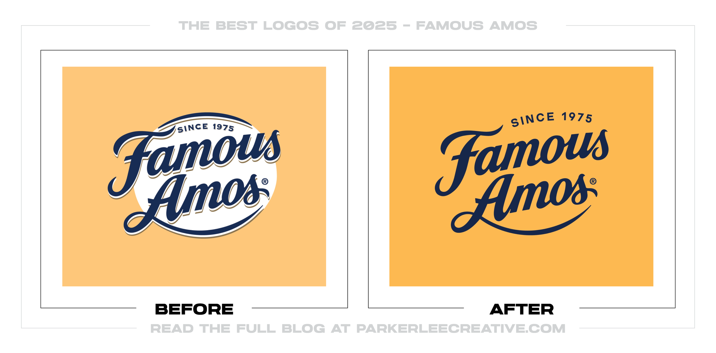
#25 - Famous Amos
Famous Amos’ refresh modernizes the brand while leaning into the playful spirit that made it recognizable in the first place. The redesign works because it simplifies the look, strengthens typography, and creates a cleaner, more scalable identity for packaging and retail.
Why It Made the List:
• The updated wordmark improves shelf readability, which is essential for impulse-driven categories like cookies and snacks.
• The design feels more contemporary without losing personality, avoiding the common trap of over-minimalizing a fun, nostalgic brand.
• The system is more flexible across products and campaigns, making it easier to stay consistent while still leaving room for flavor-level
The best logo redesigns of 2025 prove a simple point: modernizing does not mean erasing. The strongest updates protected brand recognition, improved performance across real-world touchpoints, and built flexible identity systems that can evolve without losing what made the brand memorable.
If you’re considering a rebrand, now is the right time to reach out. A professional process keeps the focus on what matters: protecting recognition, improving clarity everywhere your logo appears, and building a visual foundation that supports long-term growth. Use the contact form below, and together, the next version of your brand can look sharper, feel more consistent, and show up with more confidence.
Legal Disclaimer: This content is provided for educational and informational purposes and is intended as commentary and criticism; all product names, logos, and trademarks are the property of their respective owners, and any copyrighted materials shown are used under the principles of fair use solely to identify the subjects discussed and to support analysis, with only the limited portions reasonably necessary displayed; no sponsorship, endorsement, affiliation, or partnership is implied, and nothing on this page constitutes legal, financial, or other professional advice.