
Welcome to The 24 Worst Logos of 2024, one of two articles in my annual Best and Worst Logos of the Year series. Every year, I look back at the rebrands that caught my attention and share what businesses can learn from them. Here, we are going to take a look at some of this year’s rebrands that may have missed the mark. Looking for The 24 Best Logos of 2024? Read the companion article to learn about some of this year’s strongest work.
Below, I break down The 24 Worst Logos of 2024. For each one, I look at why the business rebranded, where the new identity falls short, what it gives up, and what your business can learn before starting a rebrand of its own.
A quick note before I get into the list: I have respect for every designer, studio, in-house team and client represented here. Putting a new identity into the world is hard. These reviews focus on the finished work, but the point is not criticism for criticism’s sake. This series is here to help business owners and brand teams understand why companies rebrand, learn from the choices behind the work and make better decisions when it is their turn. The entries are numbered to make the article easy to follow, but they are not presented in any particular order. Design is subjective, and I do not expect everyone to agree with every choice. That is part of what makes these articles fun to write and discuss.
But when it does come time for you to discuss a new logo, Parker Lee Creative is an award-winning, independent creative studio specializing in logo design and brand identity. We help businesses build new identities and refresh the ones they have outgrown. Our process starts with what the logo needs to communicate, then tests the work everywhere customers will see it. If you are considering a rebrand, contact us and tell us your story. We would love to help you create something worthy of next year’s Best Logos of the Year article.
1. Bumble
Why Did the Logo Change?
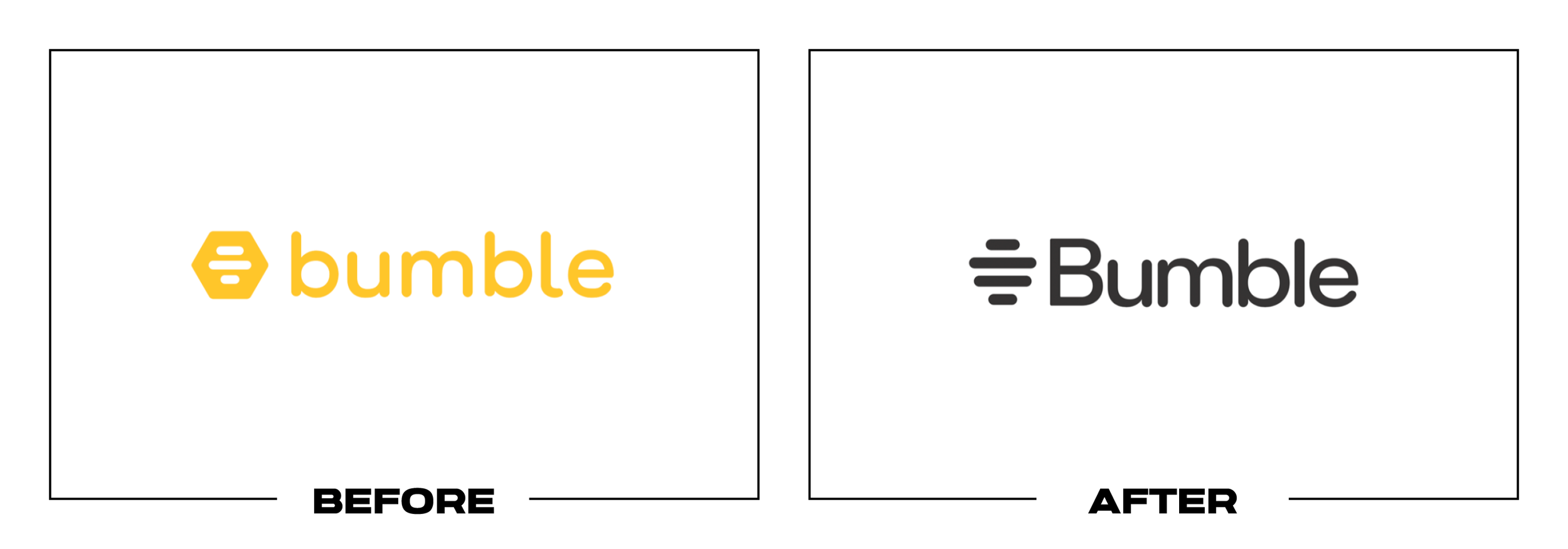
Bumble launched a new look with Opening Move, a feature designed to reduce pressure on women to start every conversation. The update simplified its honeycomb symbol, changed the initial from lowercase to uppercase, and retained yellow.
Why It Made the List:
The old honeycomb connected the app’s name, bee metaphor, and social product in one recognizable shape. The four-line replacement removes most of that story, leaving an icon that could belong to scheduling, messaging, or analytics software.
Changing a friendly lowercase b into a formal uppercase B shifts the tone at the exact moment the product wanted dating to feel easier. TechCrunch’s launch report explains the feature, but the mark does little to express its social purpose.
Yellow preserves a useful cue, yet color now carries more recognition than the symbol itself. If the icon appears in black, white, or a crowded app menu, its four strokes provide too little character to identify Bumble without the name.
The Tradeoff:
The new icon is cleaner and easier to animate or reproduce than a detailed honeycomb. Those gains matter, but simplification should remove friction, not the central idea. Bumble traded a direct tie to its name for broad digital polish.
What Businesses Can Learn:
Before simplifying a familiar symbol, list the meanings customers already receive from it. Preserve what explains the name or product, then test the new silhouette without color or text. If recognition collapses, the reduction went too far.

2. The CW
Why Did the Logo Change?
The CW needed a clearer network identity after new ownership changed its programming goals. DixonBaxi removed “The,” introduced a compact green monogram, and built an on-air package around a stage-like frame called the CW Portal on screen.
Why It Made the List:
The compressed C and W share so much structure that the mark takes a beat to decode, especially in small corner bugs. A network logo should identify the channel instantly while viewers are concentrating on the program, not the typography.
Dropping “The” makes the written mark shorter, but the network continues to be spoken as The CW. ItsNiceThat’s project report shows a lively broadcast package, yet the logo no longer matches the name audiences say, type, or search.
Bright CW green is memorable in motion, but the monogram depends heavily on animation and framing for personality. As a static avatar or affiliate lockup, it can resemble a cropped interface glyph rather than a television network.
The Tradeoff:
The wider package has energy, strong color, and a useful motion idea, while the old rounded mark had become visually tied to an earlier era. The missed opportunity was not change itself. It was asking an ambiguous monogram to carry the reset.
What Businesses Can Learn:
A media identity must work in motion and in a silent, tiny corner of the screen. Test the static mark first, verify that people can read it at a glance, and confirm that the written identity matches how customers say and search for the name.

3. Imperial College London
Why Did the Logo Change?
Imperial College London wanted a more consistent identity that reflected its science, technology, medicine, and business work. The university introduced a bold all-caps “IMPERIAL” wordmark while confirming that its legal name would not change.
Why It Made the List:
Removing “College London” from the main signature strips away both category and place, two details that help an international reader identify the institution. “Imperial” alone sounds more like a claim or conglomerate than a university.
The blunt all-caps name creates authority, but little of the curiosity associated with research and education. Imperial’s statement describes extensive consultation, yet many students saw the result as less representative of their institution.
A short wordmark simplifies digital use but pushes unfamiliar audiences toward supporting copy for context. That is a poor exchange for a global institution whose full name already carries location, history, credibility, and status.
The Tradeoff:
The wordmark is direct, legible, and easier to deploy across a complex university. Repetition may make it familiar. The issue is that operational simplicity came from removing information the primary signature could usefully retain.
What Businesses Can Learn:
Shortening a name is not automatically stronger branding. Evaluate which words provide category, geography, trust, or legal clarity before cutting them. A compact nickname can support the system without replacing the most informative signature.

4. Docusign
Why Did the Logo Change?
Docusign was expanding from electronic signatures into Intelligent Agreement Management, a platform for creating, committing to, and managing agreements. The refresh introduced new type, color, and an overlapping D symbol called the Nexus.
Why It Made the List:
The Nexus is asked to represent a D, two pages, a handshake, a portal, and the moment an agreement comes together. When one symbol needs that many explanations, none reads quickly enough to become its obvious primary meaning to customers.
Overlapping poppy and cobalt forms produce interesting color, but the silhouette resembles many abstract software marks. Docusign’s brand notice explains the legitimate product shift, while the icon does little to clarify agreements.
Docusign already owned a direct connection between its name and electronic signatures. The new mark deemphasizes that useful category memory before Intelligent Agreement Management has become language most customers recognize on sight.
The Tradeoff:
The visual language is more expressive, and its portal forms create useful layouts, motion, and product transitions. A broader platform also needs room beyond a literal signature. The weakness is treating a flexible device as a distinctive logo.
What Businesses Can Learn:
A logo does not need to illustrate every strategy word in the brief. Choose the one idea customers should understand first, then let messaging and supporting graphics carry the rest. Multiple hidden meanings rarely produce faster recognition.

5. Halo Studios
Why Did the Logo Change?
Microsoft renamed 343 Industries as Halo Studios while announcing a move to Unreal Engine 5 and several projects in development. The change was meant to signal a new chapter for the team responsible for one of gaming’s best-known franchises.
Why It Made the List:
Naming the developer after its only franchise creates immediate clarity but little equity independent of the product. The studio is defined by what it manages, making any future expansion or organizational change harder to explain.
The angular H symbol echoes Halo’s military science-fiction world, yet it could appear as an in-game faction badge. Halo Waypoint’s announcement spends more time on tools and process because the mark cannot tell studio from story.
Replacing 343 Industries removes a name with deep franchise meaning, but the solution is literal rather than ownable. “Halo Studios” reads like a production label, fan collective, or location before it reads as a distinct developer.
The Tradeoff:
The name is impossible to misunderstand inside the Xbox portfolio, and a franchise-focused team may not need room to become anything else. It also draws a clean line under the 343 era. That clarity comes at the cost of institutional identity.
What Businesses Can Learn:
Naming a company after its largest product can simplify the present while restricting the future. Decide whether the organization needs equity of its own, then test how the name would work after a new product, owner, team, or strategy appears.

6. Jaguar
Why Did the Logo Change?
Jaguar was preparing to return as a smaller, higher-priced electric car brand after pausing new vehicle sales in several markets. Its 2024 reveal introduced a mixed-case wordmark, a circular monogram, vivid colors, and a new visual device.
Why It Made the List:
The “JaGUar” wordmark uses mixed cases to express symmetry, but it makes a famous name look typeset incorrectly. The eye notices the case shift before it receives any useful idea about performance, luxury, electricity, or innovation.
Jaguar retired the leaping cat from the primary signature before showing the vehicle that could justify such a sharp break. The company’s reveal explains the symbols, but that explanation arrived before meaningful product evidence.
The circular J and R monogram can create patterns, yet its symmetry is easier to admire than to identify. Without the wordmark or cat nearby, the device has little immediate relationship to Jaguar and competes with luxury fashion monograms.
The Tradeoff:
The world is bold and willing to reject predictable automotive imagery. That courage may fit the electric cars that followed. The launch problem was sequencing: a radical symbol reset appeared before customers could connect it to a product.
What Businesses Can Learn:
When a redesign signals a major business pivot, reveal the evidence and visuals together. Customers can accept a sharp break when the product, experience, and strategy make it believable. A logo should not carry the transformation alone.

7. Kleenex
Why Did the Logo Change?
Kleenex used its centennial to unify a global identity that had accumulated different logos, colors, and packaging structures by market. Turner Duckworth retained the script and placed it inside a blue crown inspired by folded tissue.
Why It Made the List:
The script already had strong recognition, but the crown adds visual mass and narrows its usable proportions. On small packages or digital placements, the blue shape can overpower the wordmark it was built to protect across markets.
A tissue fold is relevant, while a crown adds a leadership claim customers do not need. Creative Boom’s coverage explains both readings, revealing how hard the device works to justify its bulky silhouette and fixed proportions alone.
The holding shape makes global consistency easier, yet it reduces the script’s ability to sit naturally on photography, soft materials, and varied formats. A flexible signature becomes a fixed badge in a category built around softness.
The Tradeoff:
The broader redesign solves genuine fragmentation, and the crown provides a repeatable frame for regional packs and campaigns. The problem is not global consistency. It is making the most recognizable asset carry a bulky metaphor to achieve it.
What Businesses Can Learn:
When a wordmark already owns the category, treat every added container as a cost. Test whether it improves contrast, reproduction, and navigation enough to justify the extra shape. Consistency can come from rules without enclosing the logo.

8. Lamar Advertising
Why Did the Logo Change?
Lamar Advertising refreshed a century-old outdoor media company across billboards, transit, airports, digital displays, sales materials, and corporate communications. Heyo rebuilt the wordmark, revived its mascot, and expanded the palette.
Why It Made the List:
The geometric wordmark is more balanced than its italic predecessor, but the rounded green enclosure makes a large outdoor-media company feel compact. Lamar sells visible public space, while its primary mark behaves like a small label.
A richer palette gives teams more tools, yet the mascot and wordmark pull in different stylistic directions. Brand New’s project record shows an expressive toolkit without resolving which asset should lead across corporate and public uses.
Outdoor advertising is judged from a distance and often at driving speed, making broad proportions and immediate recognition especially valuable. The narrow signature sacrifices some of that presence before it ever appears on a billboard.
The Tradeoff:
The refresh respects Lamar green and builds a more useful communication kit than the previous corporate look. Accent colors help teams organize content. The central wordmark feels smaller and more contained than the medium it sells.
What Businesses Can Learn:
Design the company logo for the same conditions customers buy from it. A billboard business should test at distance, a mobile company inside a crowded app, and a packaging company on shelf. Context can expose weaknesses a mockup hides.

9. Lamborghini
Why Did the Logo Change?
Lamborghini updated its crest after more than two decades as part of a strategy centered on sustainability, decarbonization, and a new vehicle generation. The bull remained, but flatter construction and broader type changed its finish.
Why It Made the List:
The previous badge used dimensional gold and black to convey the crafted, excessive character associated with Lamborghini. Flattening those materials makes a cleaner file now, but it also makes a supercar emblem feel more ordinary.
Lamborghini describes black, white, yellow, and restrained gold as bold and minimal. Its official logo history confirms the reduction, yet the thin gold edge loses impact precisely where the old crest conveyed rarity and material value.
Allowing the bull to appear alone improves flexibility, but the simplified animal loses sculptural tension at small sizes. It remains recognizable because of decades of exposure, not because the redraw makes its charging form stronger.
The Tradeoff:
Flat artwork is easier to animate and reproduce, while the physical vehicle badge can still use depth and material. The concern is whether a luxury marque should pursue digital neatness when expressive excess is part of its value.
What Businesses Can Learn:
Production efficiency is one criterion, not the entire brief. Before flattening a premium mark, identify which material effects convey craft, price, or personality. Simplify the file for screens without erasing the reason it feels valuable.

10. LA Clippers
Why Did the Logo Change?
The LA Clippers needed a stronger identity before moving into Intuit Dome and opening a new chapter away from a shared arena. The team introduced a nautical crest, custom script, revised colors, and uniforms for the 2024-25 season.
Why It Made the List:
The primary mark combines a ship, compass points, a C, basketball seams, and a circular badge. Each reference can be explained, but together they create a diagram that demands more attention than a sports logo receives during play.
A ship gives “Clippers” a direct visual answer, yet the top view resembles a cruise liner or arena seating plan before a fast vessel. The team’s announcement identifies every component, confirming how much interpretation is packed inside.
Thin interior lines and small compass details become fragile on caps, score graphics, and social avatars. The surrounding script and nautical flags have personality, but the main crest is the least efficient asset in the package.
The Tradeoff:
The redesign finally gives the team a concept tied to its name, and the navy, red, powder blue, and script create a coherent game-day world. The problem is not the nautical direction. It is forcing every part of that direction into one badge.
What Businesses Can Learn:
A logo should capture the strongest idea, not inventory every approved idea. Rank the symbols by importance, place one in the primary mark, and let patterns, secondary graphics, environments, and language develop the rest of the story.

11. LA Kings
Why Did the Logo Change?
The LA Kings wanted to unite franchise eras before the 2024-25 season. House Industries rebuilt the 1988 shield associated with Wayne Gretzky, restored the original 1967 crown, and retained the modern black, silver, and white palette.
Why It Made the List:
Combining the Gretzky-era shield with the launch-era crown produces nostalgia from two separate chapters rather than one clear historical position. The result feels assembled from fan favorites instead of designed around a present-tense idea.
The crest places small “Los Angeles” type, large “Kings” lettering, and a detailed crown inside one compact shield. The Kings’ official reveal documents redrawing, but craftsmanship cannot remove that density in live broadcast or merchandise.
Black and silver preserve recent recognition, yet the restored structure still reads like a historical sports badge. On helmets and broadcast graphics, the many outlines and internal scales make it heavier than the team’s simpler crown assets.
The Tradeoff:
Fans receive a familiar silhouette and a direct link to the franchise’s celebrated era. The redraw is more coherent than an archive copy. The cost is a visual platform built around looking backward when a new chapter needed its own voice.
What Businesses Can Learn:
Heritage can guide a redesign without dictating every component. Choose one era, idea, or asset to revive, then rebuild the rest around current needs. Combining several beloved references can weaken the hierarchy each one once had.

12. MotoGP
Why Did the Logo Change?
MotoGP wanted to grow beyond racing enthusiasts and present the championship as a broader entertainment property. Pentagram replaced the checkered-flag monogram with a custom wordmark whose letters reference bikes, riders, wheels, and track.
Why It Made the List:
The old symbol communicated racing through a checkered flag in a fraction of a second. The replacement hides its story inside letter construction, asking viewers to discover two bikes in M, wheels in O, a rider in T, and a track in the G.
Custom geometry gives the wordmark motion, but its wide futuristic forms resemble technology and mobility brands outside racing. Pentagram’s case study explains the embedded references because the static logo does not reveal them reliably.
Removing the standalone flag leaves MotoGP without an equally compact symbol for helmets, app icons, timing screens, and broadcast bugs. Cropping or animating the letters can fill those roles, but neither creates a simple replacement asset.
The Tradeoff:
The identity is highly flexible in motion, and the custom type gives promoters a consistent platform across events, video, and merchandise. MotoGP needed more than a legacy badge. The mistake was discarding its fastest visual shorthand.
What Businesses Can Learn:
Hidden meaning can reward attention, but it should not replace immediate meaning. Keep one fast category or product cue for small, fleeting uses, then let custom lettering and motion add depth for people who have time to explore the system.

13. Mountain Dew
Why Did the Logo Change?
Mountain Dew wanted to reconnect with its outdoor origins and make the full product name easier to read. PepsiCo restored “Mountain” after years of “Mtn Dew,” revived details from its 1948 logo, and rebuilt packaging around mountain scenery.
Why It Made the List:
Restoring the full name improves clarity, but the wordmark surrounds it with outlines, shadows, citrus leaves, and a mountain landscape. The logo tries to deliver heritage, flavor, energy, and an outdoor story before the package adds anything.
Retro forms fit Mountain Dew’s history, yet the many eras do not resolve into one visual period. PepsiCo Design’s case study lists the 1948 references, while the final mark retains later extreme-sports aggression and layered outlines.
The dense lockup performs on a large bottle label, but it becomes difficult to reduce for digital ads, flavor tabs, sponsorships, and small merchandise. Alternate versions will have to remove the very scenery used to justify the redesign.
The Tradeoff:
The complete name is easier to understand, and the landscape gives Mountain Dew a story beyond gaming and stunts. The package can feel energetic on shelf. The concern is that a useful strategic correction became an overloaded primary signature.
What Businesses Can Learn:
A redesign can restore history without displaying every cue at once. Decide whether the primary logo must carry origin, category, flavor, and attitude, then move secondary ideas into packaging and campaigns where they have room to work.

14. Mozilla
Why Did the Logo Change?
Mozilla wanted to reassert itself as an activist technology organization, not only the company behind Firefox. Jones Knowles Ritchie introduced a flag-like M, custom type, an ASCII dinosaur, and an open toolkit under “Reclaim the Internet.”
Why It Made the List:
The new M combines a flag, pixel, and hidden dinosaur, but its blocky silhouette first resembles a construction barrier or industrial label. A mission-led organization needs a symbol people can identify before reading its design notes.
The 2017 “moz://a” wordmark referenced web syntax but made readers decode a punctuation-heavy name. Mozilla’s 2024 report explains the activist shift. The new mark drops that digital cue without creating a clearer link to open internet work.
The dinosaur adds warmth in illustration, but it is not reliably visible in the primary logo. Mozilla still depends on surrounding assets to distinguish the parent organization from Firefox, a confusion the update was positioned to reduce.
The Tradeoff:
The flag can become a strong campaign device, custom type is expressive, and the open toolkit suits Mozilla’s values. The wider system has conviction, but its central mark still needs explanation and trades one reading problem for another.
What Businesses Can Learn:
If customers confuse the company with its best-known product, make the new identity clarify that relationship immediately. A flexible campaign symbol can help, but the primary signature still needs a direct, repeatable point of recognition.

15. Paramount
Why Did the Logo Change?
Paramount and Skydance showed a proposed “New Paramount” logo during an investor presentation after announcing a merger. The prototype retained Paramount’s mountain and stars but replaced its script with a serif treatment based on Skydance.
Why It Made the List:
The design splits the difference between two companies instead of deciding what the business should stand for. Paramount supplies the mountain, Skydance supplies the typography, and neither element becomes stronger through the pairing.
Replacing the famous script with an arched serif name makes an entertainment landmark feel closer to a financial holding company. Fast Company’s review documents the investor-call reveal and its corporate tone problem in detail.
This was a prototype, not a replacement for Paramount Pictures’ logo, and the completed 2025 company adopted different branding. Even so, showing unfinished work to investors turned a transaction graphic into a public visual promise.
The Tradeoff:
The mountain and stars preserve the most important Paramount equity, while the restrained wordmark suits a corporate parent with many operating brands. The mistake was presenting a merger compromise as an identity before the new company existed.
What Businesses Can Learn:
Transaction graphics and permanent identities solve different problems. Label interim artwork clearly, limit its use, and wait until leadership, architecture, and strategy are settled before asking a combined logo to represent the future.

16. PayPal
Why Did the Logo Change?
PayPal wanted to feel simpler, more neutral, and more confident as it competed across checkout, peer payments, credit, and merchant services. Pentagram introduced a black wordmark, custom PayPal Pro type, and a disciplined motion system.
Why It Made the List:
The new wordmark is clean enough to disappear beside almost any retailer, but that neutrality also makes it resemble countless financial and technology names. PayPal traded some of its recognizable blue character for typographic anonymity.
The overlapping blue P monogram remains, yet it is treated separately from the black name. Pentagram’s case study shows how motion reconnects them, but a static checkout button cannot always provide that choreography or context.
Removing yellow and limiting cyan and blue creates a calmer environment, but leaves the logo dependent on placement for distinction. In payment interfaces crowded with black wordmarks, reduced friction and reduced recognition can look alike.
The Tradeoff:
The system behaves exceptionally well in motion, pairs cleanly with merchant brands, and gives product information more room. PayPal needed consistency across a large platform. The cost is a primary wordmark with little proprietary character.
What Businesses Can Learn:
Neutrality can help a platform support customer content, but the logo needs an owned cue. Test it beside each major competitor in the same interface. If the names become interchangeable, preserve more color, shape, or typographic character.

17. Rate
Why Did the Logo Change?
Guaranteed Rate shortened its name to Rate as part of a financial-technology strategy focused on speed and simpler experiences. The company kept its red downward arrow, introduced a compact lowercase wordmark, and phased the name by state.
Why It Made the List:
“Rate” describes a number every lender offers, making the name difficult to own in conversation, search, and memory. Removing “Guaranteed” may reduce a risky promise, but it also removes the only word that made the former name specific.
The red arrow still points down to suggest lower rates, yet its placement beside the short word can feel like a market decline indicator. The company’s explanation confirms the retained idea without resolving that financial contradiction.
State-by-state regulatory timing meant Guaranteed Rate and Rate appeared together during rollout. That operational reality makes an already broad new name harder to establish and places even more recognition pressure on a small arrow.
The Tradeoff:
Rate is shorter, easier to fit in product interfaces, and broad enough for services beyond mortgages. The company also retained its best-known symbol. The trade is reduced verbal distinction in a category where trust and specificity matter.
What Businesses Can Learn:
A shorter name must be evaluated beyond logo layout. Test searchability, conversation, legal ownership, category confusion, and negative visual readings. If the word is generic, a symbol alone may not provide enough distinction to compensate.

18. Sandisk
Why Did the Logo Change?
Sandisk introduced a new identity before separating from Western Digital as an independent flash and memory technology company in 2025. The wordmark uses a pixel-built S, an open D, and custom forms intended to express data and possibility.
Why It Made the List:
The wordmark assigns a different visual trick to several letters: the S is fragmented, the D is open, and the remaining forms are sharply constructed. Instead of one memorable rule, the eye has to solve competing typographic events.
The open D is meant to represent expanding possibility, but it can be mistaken for a parenthesis or incomplete letter. Sandisk’s announcement explains the idea, which is less obvious than the readability problem it creates in a familiar name.
A data company needs precision, yet the pixel S loses definition as the logo becomes small while the open D creates a large gap. The combination makes the name least stable in the compact digital and hardware placements it must master.
The Tradeoff:
The mark is unmistakably new, and its custom geometry gives the separated company a visual break from Western Digital. Motion can assemble the S and open the D effectively. The static wordmark carries too many concepts at the same time.
What Businesses Can Learn:
Custom lettering is stronger when one construction rule governs the name. Choose the most useful idea, apply it selectively, and test whether each unusual letter improves recognition. Distinction should not require decoding the spelling.

19. Six Flags Entertainment Corporation
Why Did the Logo Change?
Cedar Fair and the former Six Flags completed a merger in July 2024, creating a new company under the Six Flags name while retaining Cedar Fair’s FUN stock ticker. The corporate signature added a restrained wordmark and red flag accent.
Why It Made the List:
The new company kept one partner’s name and the other partner’s ticker, but the logo does not help customers understand the combined portfolio. It looks like a minor Six Flags cleanup rather than an identity for two major park operators.
Reducing six colorful flags to one small red accent improves corporate restraint while removing the abundance tied to the name. The merger announcement explains the scale, portfolio, and merger that the modest mark barely reflects.
“Entertainment Corporation” sits as a small descriptor beneath a familiar consumer name, creating a hierarchy that is hard to reproduce at small sizes. Without that line, the parent entity and individual park name become indistinguishable.
The Tradeoff:
Using Six Flags avoids teaching customers a new parent name, and the navy wordmark feels credible for investors and partners. Existing parks retained their names. The weakness is a corporate signature that clarifies neither merger nor structure.
What Businesses Can Learn:
A merger identity should explain which equity survived, how the portfolio fits together, and when the parent mark appears. Judge more than the logo. Test naming, descriptors, endorsed properties, legal entities, and customer-facing uses.

20. Switzerland Tourism
Why Did the Logo Change?
Switzerland Tourism replaced a golden edelweiss used for nearly thirty years with a destination wordmark. The new design turns the final t into a Swiss cross, introduces five shades of red, and supports a phased global rollout across markets.
Why It Made the List:
Converting the final t into a cross creates a clever national reference, but it interrupts the spelling and can make “Switzerland” look incomplete. A tourism name must read effortlessly for visitors encountering it across many languages.
The old edelweiss offered a compact symbol for maps, signs, social icons, and partner lockups. Industry coverage of the rollout describes better digital performance, yet the long wordmark is less flexible in narrow spaces and partner formats.
Five red tones add depth to the Swiss cross, although gradients complicate reproduction and dilute the blunt power of national red and white. The effect decorates a familiar symbol without making the destination more emotionally specific.
The Tradeoff:
The new mark says the country’s name directly, works without a separate tourism descriptor, and creates a shared system for partners. It also avoids relying on one alpine flower. The cost is losing a compact, friendly destination asset.
What Businesses Can Learn:
Wordmarks can improve clarity, but long names still need a small-use strategy. Test translations, pronunciation, narrow formats, embroidery, and partner lockups before retiring a symbol. A clever letter substitution must never slow reading.

21. Westchester County
Why Did the Logo Change?
Westchester County needed to remove an obsolete .com address from its identity as government sites moved to .gov. Joy Riot developed new full-name and WCNY marks, a three-color palette, and a hook joining letters to represent connection.
Why It Made the List:
The hook joining the C and H is explained as a symbol of linked communities, roads, rail, air, and culture. In the wordmark, it reads first as a loose squiggle through a letter, making the intended connection feel added rather than built in.
The hook closely resembles the crossbar behavior in Hinge’s logo, an avoidable conflict that dominated public reaction. Local coverage of the launch provides the county’s rationale but cannot erase the resemblance across everyday digital use.
WCNY is compact, but it reads like a broadcast call sign and does not naturally expand to Westchester County. Several signatures solve layout needs while making residents learn an abbreviation that the place did not own as a government.
The Tradeoff:
The old web address genuinely had to go, and the new palette can represent history, waterways, and the environment across public communications. The county also gathered input. The weak point is forcing connectivity into a decorative hook.
What Businesses Can Learn:
When a symbol resembles an established mark in an adjacent public context, intent will not prevent comparison. Run visual conflict checks early, test unexplained readings, and make sure a new abbreviation already belongs naturally to the name.

22. Canadian Army Supplementary Icon
Why Did the Logo Change?
The Canadian Army introduced a supplementary communications icon for presentations, social content, and video. It combined a maple leaf with pixelated camouflage, but officials later clarified that it did not replace the Army’s official emblem.
Why It Made the List:
The camouflage blocks overpower the small maple leaf and do not resolve into a recognizable silhouette. At thumbnail size, the device can look like damaged pixels rather than a deliberate symbol associated with service or national defense.
Initial coverage treated the graphic as a replacement logo because its limited role was not made clear at launch. The Army’s communications strategy gives the proper context, but that clarification arrived after widespread confusion.
A supplementary icon can be more experimental than an official emblem, yet it still represents the institution when it appears alone. The gray-brown pattern lacks the contrast and authority needed for social avatars, slides, and video corners.
The Tradeoff:
Connecting the device to current camouflage gives communications teams a flexible visual texture, and the official Army badge remains untouched. Used as a supporting crop instead of a logo, the pixel pattern can help organize campaign materials.
What Businesses Can Learn:
Define every new asset before release. State whether it is a primary logo, campaign mark, pattern, icon, or temporary device, then show correct uses. Even good supporting graphics create confusion when audiences assume they replaced the emblem.

23. Tropicana
Why Did the Logo Change?
Tropicana wanted its European packaging to reclaim the orange, craftsmanship, and heritage after years of inconsistent brand assets. Sunhouse restored the arched wordmark, dotted its i with an orange, and added “The Original since 1947.”
Why It Made the List:
The arched wordmark and orange dot strengthen product cues, but wrapping a script heritage line beneath the name creates a busy roundel. The signature now asks two type styles and a literal fruit accent to compete for attention.
Heritage also appears through the founder’s signature, grove imagery, hand-drawn fruit, and the orange-with-straw symbol. Packaging News’ report shows a rich pack, but the logo does not need to repeat every proof point in a permanent lockup.
“The Original since 1947” is more effective as supporting copy than permanent logo furniture. At small sizes it becomes unreadable, while removing it changes the silhouette and creates another version for teams and retailers to manage.
The Tradeoff:
The overall packaging restores strong Tropicana assets and corrects the category anonymity associated with its 2009 redesign. The orange, straw, color, and imagery work well. The weakest choice is fastening a heritage sentence to the logo.
What Businesses Can Learn:
Heritage belongs in an identity, but not every proof point belongs in the primary mark. Keep the signature recognizable at small sizes, then use packaging, photography, seals, and copy to tell the fuller origin story with room to breathe.

24. Visit Detroit
Why Did the Logo Change?
Visit Detroit introduced a bolder platform centered on movement, meant to reflect the city’s energy, influence, and local voices. The logo makes Detroit dominant in an angular script while placing Visit above it as a small qualifier.
Why It Made the List:
The Detroit lettering has speed and attitude, but several angular joins are difficult to parse at first glance. A destination mark must help unfamiliar travelers identify the place quickly, not reward only people who already know what it says.
“Visit” becomes a small qualifier above the dominant script, reducing the invitation and the organization’s role. Visit Detroit’s launch release explains the storytelling platform better than the lockup does for travelers encountering it once.
The sharp lettering conveys movement, yet its compressed angles create weak small-size forms for wayfinding, partner badges, social icons, and travel listings. Those are core destination uses where clarity should outrank expressive flourish.
The Tradeoff:
The mark rejects safe tourism conventions and gives Detroit a confident voice tied to music, movement, and culture. It has presence in large campaign uses. The loss appears when that expressive script must perform as public information.
What Businesses Can Learn:
Expressive lettering still has a job to do. Test a destination, event, or public-service name with people who have never seen it, at the smallest required size and for only a second. Personality matters after the words can be read.
What the Worst Logos of 2024 Have in Common
The weakest redesigns were not undone by one visual trend. They struggled because a useful idea was removed, too many ideas were packed into one mark, or the logo was asked to explain a business change it could not carry alone. Bumble and PayPal surrendered character for neutrality. The Clippers, MotoGP, and Docusign buried meaning in explanation. Jaguar and Paramount revealed identity before the surrounding transformation was ready.
Several projects also demonstrate that context changes the verdict. The Canadian Army graphic is a supplementary icon, not a new official emblem. Paramount showed a merger prototype, not a replacement for the Paramount Pictures logo. Tropicana’s broader package has strong work even though its permanent heritage line burdens the mark. Fair criticism starts by identifying what was actually released and where it was supposed to work.
For a stronger set of decisions from the same year, read The 24 Best Logos of 2024. That list examines redesigns that protect useful equity, clarify complex organizations, and create practical systems around a focused idea.
Logos and trademarks are the property of their respective owners and are shown for identification, commentary, and criticism. No endorsement or affiliation is implied.
Thanks for Reading The 24 Worst Logos of 2024
Thanks for reading our annual Worst Logos of the Year article. It really means a lot to me. I also want to thank every designer, studio, in-house team and client who brought this year’s work to life. I may have opinions about the results, but this series would not exist without people willing to take creative risks in public.
For the other half of this year’s series, read The 24 Best Logos of 2024. You can also browse the blog for earlier Best and Worst Logos of the Year articles and more logo design reviews.
Does your business need a new logo? We provide logo design and brand identity services for businesses that need something new or have outgrown what they already use. Fill out the form below and tell us your story. We would love to help forge a new identity for your brand that connects with your customers, tells your story, and lands you at the top of next year’s Best Logos of the Year article.
Legal Disclaimer: This content is provided for educational and informational purposes and is intended as commentary and criticism; all product names, logos, and trademarks are the property of their respective owners, and any copyrighted materials shown are used under the principles of fair use solely to identify the subjects discussed and to support analysis, with only the limited portions reasonably necessary displayed; no sponsorship, endorsement, affiliation, or partnership is implied, and nothing on this page constitutes legal, financial, or other professional advice.
